Praline creates The Culture Diary branding based on the “golden ratio rectangle”
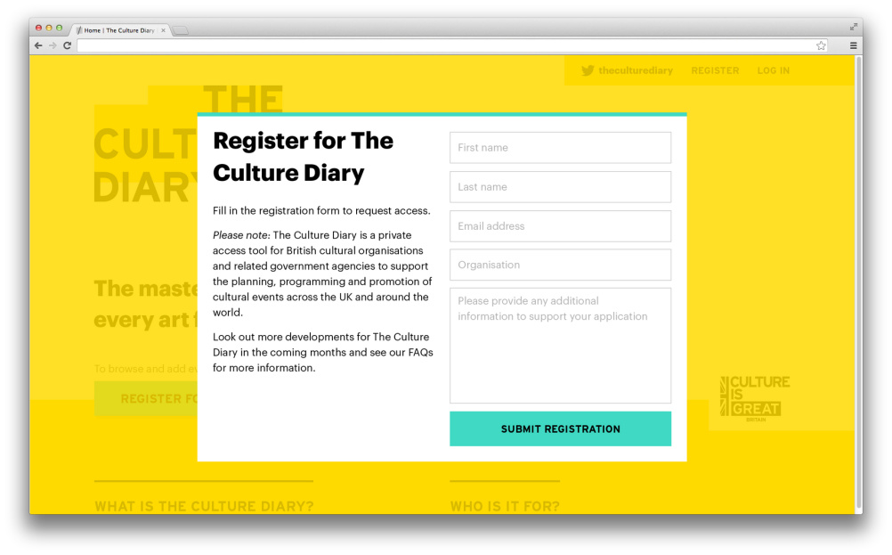
Praline has branded The Culture Diary – an online system which aims to help UK cultural organisations avoid event clashes and collaborate.
The Culture Diary is delivered by the Greater London Authority, and uses an online database that can be accessed only by British cultural organisations and related Government Agencies, looking to help plan and promote UK cultural events.
It is free to use, and looks to foster collaborations between different organisations and with Government.
Praline designed an identity around a grid system, which is based on the “golden ratio rectangle”. The shape is formed from a particular formula that means that when a square section is removed, the remainder is another golden rectangle with the same aspect ratio as the first.
Using this as a starting point, the identity can take on many formats, using abstract shapes inspired by the calendar itself, evolving and changing colour with the different months of the year. These will reflect the seasons with warmer tones for summer, and cooler colours used for winter.
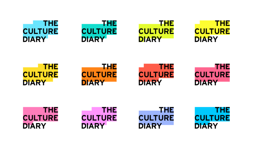
Praline says: “Whilst this identity is dynamic, there is a consistency between every logo, helping ‘The Culture Diary’ build a strong brand and establish itself in the cultural industry.”
The logo will be used across the Culture Diary website and other digital applications such as social media platforms, as well as on company stationery. The website was developed alongside digital agency With Associates.

The Culture Diary has been delivered in partnership with the British Council, Arts Council of England and the Department for Culture Media and Sport. It is supported by Visit Britain, the Foreign and Commonwealth Office and UK Trade and Investment.

Read this next


Kind of reminds me of the Cystic Fibrosis identity by Johnson Banks, just reflected and without the personality or crafting.