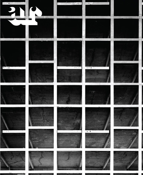
Architectural Review redesigns with Simon Esterson
Simon Esterson has worked on a redesign of the Architectural Review, which is relaunching with its October issue.

Esterson worked with AR art editor Jon Morgan, formerly of Dazed & Confused, on the project.
Morgan says, ‘We’ve really tried to give the AR an object quality again, to try to emphasise the value of print media, of holding something in your hand, to fight against the trend of everything migrating online.’
The new design sees the implemenation of a grid system, which Morgan says ‘has a lot of flexibility to lay out different types of content’. Two different paper stocks are used – a glossy one for photo features at the front of the magazine and a matt one for essays at the back.

A serif and a sans serif font have been created. Morgan says, ‘They’re new fonts, but they have some of the spirit of Bill Slack [the AR’s art editor for more than 30 years, who retired in 1989].’
The cover has been stripped back to feature just a large image and a small AR logo.
Morgan says, ‘The magazine was established in 1896 so it needs to look assured graphically. We’ve deliberately tried to make the AR neither “retro” nor “trendy”, which is always a danger with such an old magazine.’
The AR, which is published by Emap, was last redesigned in 2009 by Alexander Boxill and then-art director Cecilia Lindgren.


Much needed! The minimal page furniture on the covers will look so refreshing. Looking forward to seeing the finished article as it were.