BBC launches redesigned homepage
The BBC has redesigned its homepage, which is now based around a ‘carousel’ central feature.
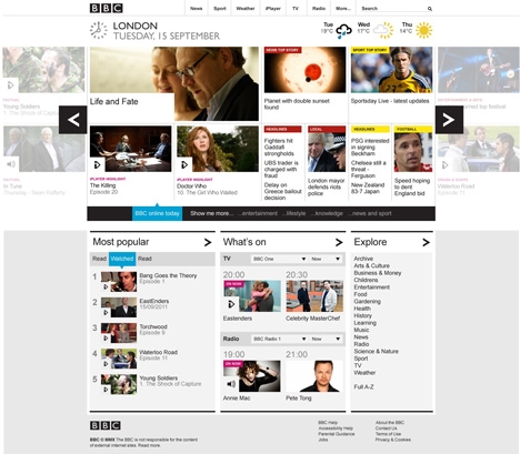
The BBC says the new homepage, which uses elements of the global visual language developed last year by Neville Brody’s Research Studios, is ‘the first glimpse of the core design principles that will underpin the reshaped BBC online.’
It adds, ‘It is envisaged that these principles will be reflected across the evolving products of BBC Online, and pave the way for a graphically rich London 2012 Olympics digital offer.’
The BBC says the new design is influenced by the growth of touch-screens and user preference to ‘swipe’ through content.
The central carousel features colour coding to denote categories and icons to denote content type. A ‘drawer’ feature can reveal more detail for content while filters allow users to tailor the page to their requirements.
The homepage redesign comes after a strategy launched at the start of the year to make the BBC online more cohesive and focus it around 10 ‘products’, including the homepage and also including news, sport, weather and other strands.
A spokeswoman for the BBC says, ‘The homepage has an important role to play in sitting centrally and binding the other products together. We think the new homepage does a better job of showcasing these products, surfacing a richer selection of output than we’ve been able to before.’
Phil Fearnley, general manager of news and knowledge for BBC Future Media, says, ‘We’ve rebuilt from first principles to deliver and intuitive experience which makes it easier for users to explore the wealth of BBC content on the web than ever before.’
The new design launches in a beta version today before a full launch later this year. The previous redesign was in 2008.
Read this next

-
Post a comment


