Bing rolls out new look
Microsoft search engine Bing is rolling out a new identity and website design.
Source: Bing
New Bing identity
The new look brings Bing into line with the overall Microsoft branding, created by Pentagram partner Paula Scher and developed by Wolff Olins, which launched last year.
Lawrence Ripsher, general manager of user experiences at Bing, says, ‘Bing is now an important service layer for Microsoft, and we wanted to create a new brand identity to reflect Bing’s company-wide role.
‘The new look integrates the “One Microsoft” vision both from a product perspective and visually.’
As well as updating the visual identity, Bing is also launching a new web design, based around ‘simplicity, speed and… a better search experience’.
Ripsher says the new design features updated fonts, spacing, colours, visual scan patterns and underlying code.
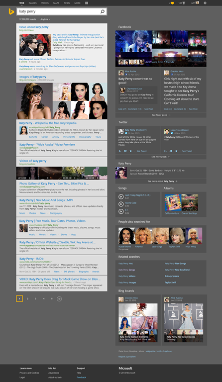
The new design combines Bing’s Snapshot feature, which shows what ‘Bing knows’ about a query, and its Sidebar, which shows what the searcher’s friends know.
Source: Bing
Bringing together the Snapshot and Sidebar features
Ripsher says, ‘This combined region ranks the key information and actions we know about an entity, while bringing in friends and expert opinions about the same topic.’
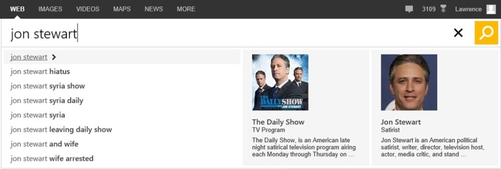
Bing is also introducing the Page Zero function, which aims to show the user search results as they are typing in the query.
Source: Bing
The new Page Zero function
Bing’s new look comes shortly after website Yahoo, whose search engine is powered by Bing, introduced a new identity, launched with its 30 logos in 30 days initiative, and a new interface.


Yahoo is not a “search engine.” 1997 called and wants you to fact-check who provides the actual searching on Yahoo. Won’t you be surprised.
What Pentagram and its partners does, I always appreciate their approach to the design they take. But for this one, I am not too convinced, graphically, the relation between the typeface and symbol is too apart. The symbol is too edgy while the typeface totally based on circular geometry. It just doesn’t click to me….