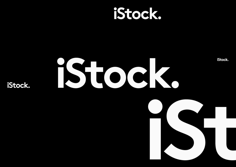
Build creates new iStock identity
iStockphoto is rebranding as iStock, with a new identity created by Build.

The company, which is part of Getty Images, is aiming to move away from being perceived as just a photo library, according to Build creative director Michael C Place.
He says, ‘They’re much more than that – they’re offering illustrations, video and other content.’

Build, which has been working on the project for around six months, initially created a full icon system as part of the branding, although this is not used in the final identity, according to Place.
Instead, the new identity is based around the iStock wordmark, with the strapline ‘By Getty Images’.
Place says, ‘The work has been very interesting as it started out as a full branding project with a supporting icon system and developed into a typographic exercise.
‘If you think about it this solution makes sense though, as how can you sum-up such an image-led organisation in a single image? As much as people might have liked the camera it just wasn’t relevant today.’

The identity also includes a full stop, which Place says is a reference to iStock’s dot-com origins, while an updated typeface is introduced.
Place adds, ‘We went through a whole range of typeface choices for the logo – and this is the one that stuck. We think it works because it’s quite friendly and casual.’
Build also worked with type foundry ARS Type to develop the supporting typeface – ARS Maquette – which will be used across advertising and other channels.
This series of images demonstrates the development of the new identity:


-
Post a comment


