Charity Breast Cancer Care ditches the pink in rebrand
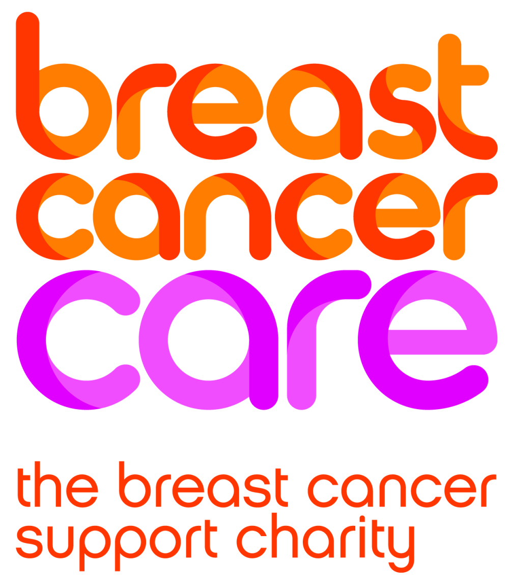
Arthur London has rebranded Breast Cancer Care, which is dropping its pink ribbon marque and introducing the colour orange to its identity.
The charity is looking to find greater recognition as ‘only one person in 100 knows who we are,’ according to Breast Cancer Care chief executive Samia al Qadhi. She says, ‘We are confident that by shining through the “pink fog” of other breast cancer charities, we will reach more people who urgently need our help.’
Arthur London’s solution was to introduce a headline font, which has been named Betty after the charity’s founder Betty Westgate.
Pink is used as a secondary colour to orange, which the charity says has been selected as it helps reflect its values of ‘togetherness, warmth and confidence’.
An accompanying strapline ‘The breast cancer support charity’ has been introduced to reinforce clarity and enforce the expertise and support services offered by the charity.
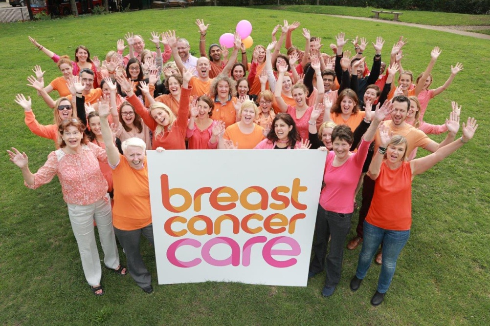
Pink will still be used for some fundraising events and the charity will still sell pink ribbons, which it says are useful fundraising assets.
The new branding, which is not yet live on the charity’s website, will roll out over the net year as this will ‘make the best use of existing assets’ it says.
Read this next


The graphic identity looks similar to Benevolent Society, Australia…designed by Designworks
A good idea to differentiate the brand from others in the same sector, interestingly only a typographic approach and no symbol.