Mammal’s ‘playful’ identity for luggage brand Antler
Mammal has created a new identity for luggage brand Antler, which aims to emphasise the brand’s ‘style and playfulness’.
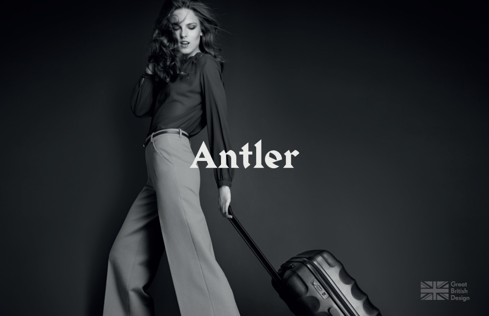
The new identity features a wordmark based on a Medieval typeface, with campaign photography by fashion photographer Matthew Shave.
Mammal was appointed to the rebrand project at the end of last year, and worked alongside strategy specialist The Cernis Collective to define Antler’s new position and identity.

Mammal founder and creative director Joe Hosp says, ‘Antler recognised that it had lost its way over the last ten years. Competitor brands were surging ahead with growth, innovation, brand awareness and credibility while the Antler brand had stagnated.’
Robin Powell, designer at Mammal, says the new identity aims to focus on the brand’s style and innovation, as well as the fact that it represents ‘Great British design’.

He says, ‘They’ve been around for nearly 100 years and they’ve always been about good style.’
Powell adds, ‘The identity uses a modern approach to a Medieval typeface, which emphasises the brand’s playfulness, while the juxtaposition of the classic typeface and the modern photography also plays up to this.’
Mammal has also replaced the previous brand mark – a stag’s head and antlers – with the A from Antler placed in a circle, which Powell says ’is perfectly fitting for a brand that’s all about movement and journeys’.

The new identity is set to launch next week, with Mammal working on the website, lookbook and launch materials, with possible further touchpoints to roll out.
Read this next


Credit for the logo type should go to Gareth Hague of Alias. The font is Harbour Bold.
Now they just need to address how they deal with stakeholders !