The Brand Union and Digit update Vodafone’s look
WPP consultancies The Brand Union and Digit have created a new ‘visual brand identity’ for Vodafone.
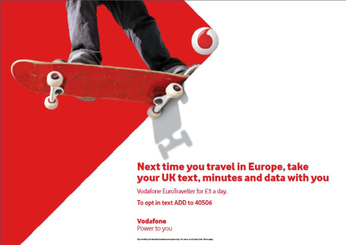
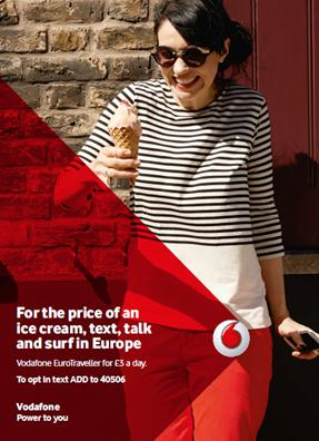
Vodafone’s existing logo is retained, and a bright red flexible rhombus shape has been added. This anchors to Vodafone’s roundel, and can be used in moving or static forms.
Vodafone says the new rhombus positions the company ‘as a catalyst for progress’.
Vodafone brand director Barbara Haase says, ‘Our new visual brand identity is a true representation of Vodafone: never static, always moving – and ensuring that our technology empowers everyone who uses it.’
The Brand Union has worked with Vodafone for several years, creating its existing identity in 2006.
For this new project, it was appointed alongside digital partner Digit to develop a new identity that would be ‘unique, adaptable across Vodafone’s markets, future-proof and modern’.
The Brand Union’s Singapore, Stockholm, London and New York teams all worked on the new identity, with the final design being conceived in Singapore and developed in London.
http://www.youtube.com/watch?v=4BNR3tcGNcQ
Read this next


Really like this. A simple and elegant solution to encompassing messaging and call to actions. The logo remains prominent without just making it ‘bigger’ and it’s versatile enough to work with different styles of photography and/or illustration.
I didn’t know Yoda wore trousers!?