The Team rebrands Royal Holloway University
The Team has created a new identity for Royal Holloway, University of London, which takes inspiration from the institution’s campus and founder’s building.
The new identity replaces Royal Holloway’s previous branding, which was created by L&Co and launched in 2007.
The Team was appointed to develop the new identity in May, and worked with Royal Holloway’s stakeholders, including current staff, students and alumni.
Aiden Brennan, The Team’s creative lead on the project, says, ‘What emerged from our research was a desire to present Royal Holloway as a memorable place to study.
‘The new brand provides a revived sense of place, balancing the reality of its inspirational close community and the university’s rich heritage.’
The Team says it was inspired by Royal Holloway’s campus, and in particular the Gothic Revival Founder’s Building, designed by architect William Henry Crossland and completed in 1881.
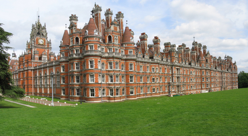
Source: Charles DP Miller
The Founder’s Building
The new colour scheme ‘[combines] the vibrant brick red of the Founder’s Building with a solid slate grey’, according to The Team.
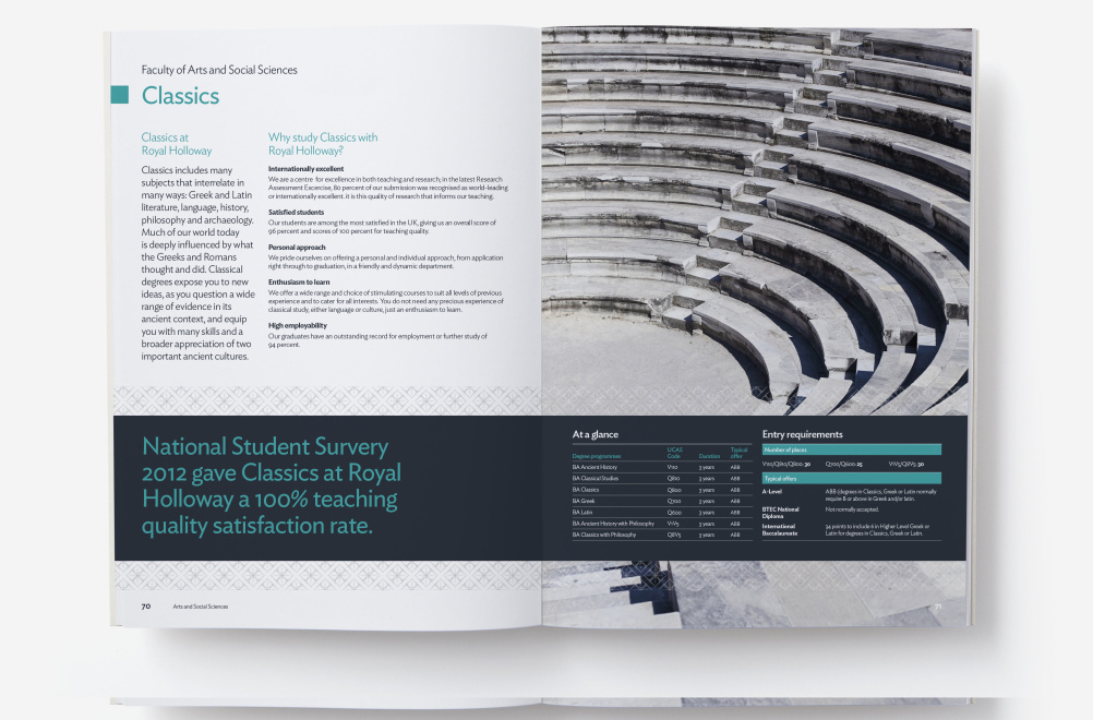
Some of the traditional patterns found around the campus are used in literature and other touchpoints, while the university’s coat of arms is used as the main motif of the logo.
Read this next

-
Post a comment


