Major League Soccer rebrands with adaptable crest system
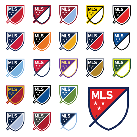
The USA’s Major League Soccer has been rebranded with a flexible identity that can be adapted to feature the home colours of every team in the league.

An in-house team has worked with US consultancies Gigunda, Athletics and Berliner Benson to develop the new identity.

The new MLS identity takes the form of a crest and replaces a football boot mark, which has been used since the league’s formation in 1994.

Each club will wear a customised crest on the sleeve of their shirt, (with their club crest appearing on the front).
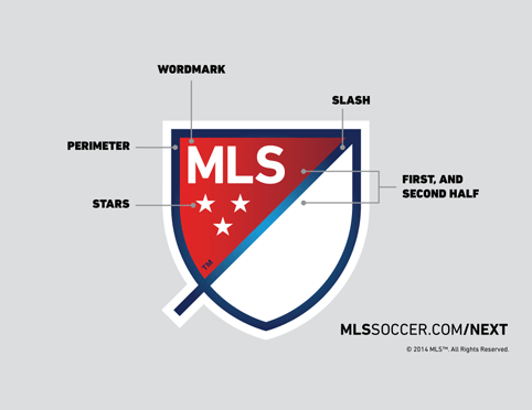
Three stars represent the pillars of the brand: for club; for country; and for community, and the outline represents the lines that mark the field of play, while the blank divisible space “brings you in and out of the MLS world”, says MLS.
A slash across the badge represents “speed and energy” beginning outside the crest and rising upwards at a 45 degree angle “to illustrate both the nonstop nature of our game and the rising trajectory of our league”, says MLS.
MLS wanted the new design to be less literal then the old one to “better reflect who we are as a league” it says.
The new design encourages clubs to “own” the crest and “match the colors they and their fans associate with and support.”
It will roll out for the 2015 season across team kits, as well as the MLS website, mobile apps and fantasy games.


Shocking