Pearlfisher bones up on Russian market for Viagra rebrand
Pearlfisher has rebranded Viagra for pharmaceutical company Pfizer creating a new look and new “snap, crack, pop” packaging.
The rebranded product, which will launch in Russia, has been prompted by Pfizer’s Russian patent for Viagra expiring this year and by a changing consumer profile.
Pearlfisher says the project has been an opportunity to make Viagra’s packaging “as iconic as the product itself” and to “design a new experience”.
Pearlfisher brand strategy director Rory Fegan says the new look needed to reconcile the tension “between Viagra’s medical expertise and consumer aspirations” which meant communicating the product’s effect “rather then the problem”.

He adds: “One of our key insights was that consumers had on average 10-seconds between purchasing the product and consuming it, and so a key consideration was to create a product experience that would be as impactful and memorable as possible.”
The new look emphasises Viagra’s “premium credentials” and encourages consumer engagement says Fegan.
Pearlfisher design director Dan Gladden says that the new brand expression is “powerful and dynamic” and communicates performance and power “in a modern and emotive way”.
Gladden says the “pharmaceutical filter” has been removed to make way for a “lifestyle-led” execution.
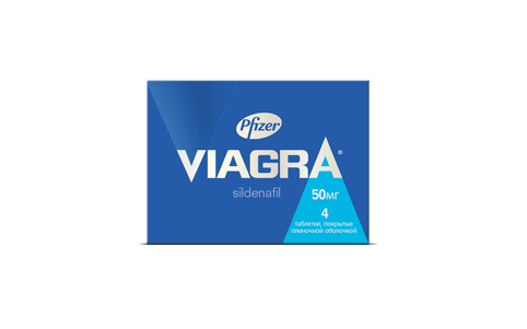
The “V” letter is now highlighted in silver with a spot varnish finish on-pack, a focal point of communication and “a mark of confidence and assurance” says Gladden.
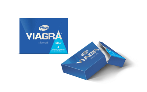
Pearlfisher has also designed the structural packaging integrating a perforated edge which runs through the “A”. It forms part of a “snap, crack, pop” feature, which the consultancy says answers the need for immediacy.
Three secondary colours have been introduced to denote 25, 50 and 100mg variants.
Pearlfisher has an ongoing relationship with Pfizer and a Pearlfisher spokewoman says that Pfizer may look at different market-specific packaging solutions if the brand is refreshed in other countries.
Read this next


Unfortunately this has left me feeling rather flaccid. Looks like a student concept designed 10 years ago.
I guess it’s a rising market, stiff competition though.
That “snap, crack, pop” looks exactly like my packaging design for Zuka snuff from 2007 🙂
http://lenart.pl/projects/zuka/