Proud Creative aims for “Instagram-like” new look for Diva
Proud Creative has worked with NBCUniversal to rebrand entertainment channel Diva, basing the new look around the theme “Light of my Life”.
The new look aims to give Diva a “feminine touch” through an identity “conveying warmth and humanity, and expressing a passionate lust for life”, says Proud Creative.

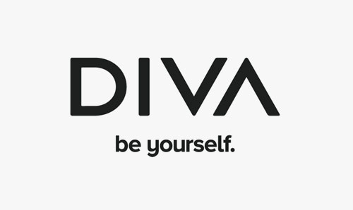
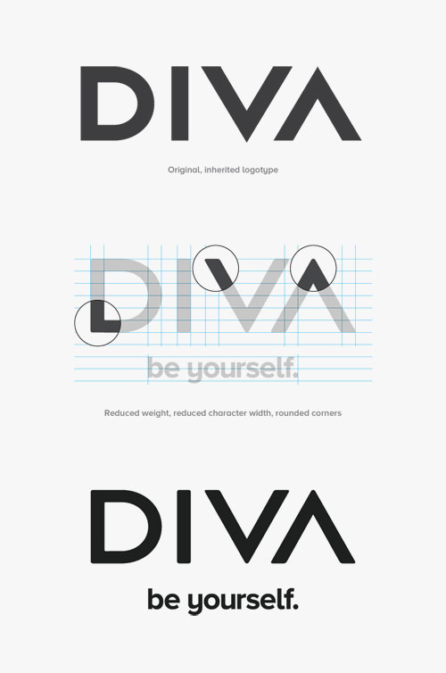
The consultancy modified the existing Diva logo, slightly rounding the corners on the typography to make the branding appear more “elegant” and humanised. These ideas are carried through to new photography and idents, which use softer edges and warmer colours.

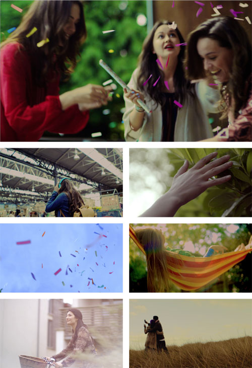
The “Light of my Life” theme is shown through the softened logo, and carried into the idents, which Proud Creative says look to achieve an Instagram-like effect.
Proud Creative says: “If Instagram is the place we store memories of moments we never want to forget, then the idents are a moving expression of this feeling. They are at once optimistic and emotive.”
Proud Creative, which worked with Jack Laurance from moving image production company Armoury on the project, having rebranded the company last year.
Read this next

-
Post a comment


