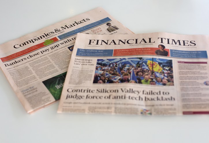
The Financial Times launches new look “for the digital age”
The Financial Times is launching a new look, which it says has been “designed for the modern reader who consumes journalism in a variety of formats”.
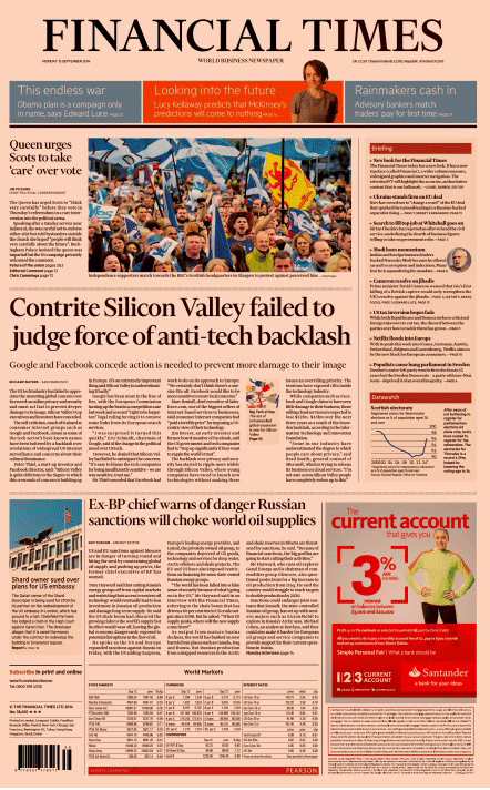
The FT adds that the new design aims to highlight “the editorial judgement and serendipity of a newspaper”. According to the Guardian, the redesign was funded to the tune of £100,000 by FT owner Pearson.
The redesign has been led by the FT’s head of design Kevin Wilson and features a new custom typeface, called “Financier”, which has been developed with Kris Sowersby of New Zealand-based Klim Type Foundry.
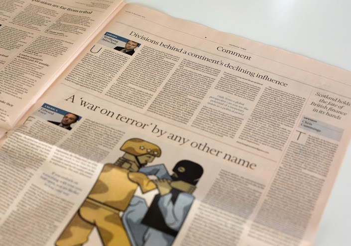
The new look also uses a wider column measure and new colour graphics and data. The FT says the aim is to translate this information and style “seamlessly between print and digital formats”.
The FT says its new-look front page allows “easier navigation of the issue”, while a new index lists companies, sectors and people mentioned in the Companies section.
The newspaper is also introducing a new Trends feature and on Friday will run a “People” column that will throw a spotlight on the people behind corporate news.
The FT says the redesign follows a series of extensive user-testing and feedback.
FT editor Lionel Barber says: “The refreshed newspaper is an agenda-setting slice of the best of the FT. It complements FT.com and other channels, providing the definitive global perspective on what readers need to know each day.”
He adds: “The new FT has visual impact and is easy to navigate, highlighting trends and providing original news, insight, analysis and context.”
This week the Guardian is also rolling out a new look, which it says brings its digital design language – developed by creative director Alex Breuer – into the print edition.
Read this next

-
Post a comment


