London Art Fair rebrand looks to give the event a “new lease of life”
The new logo acts as a “plinth” for other content while the creative campaign features different fabric backgrounds to reflect the “range of personalities” that attend the fair.

Studio Thomas has created a new visual identity for the London Art Fair, as the event looks to the future following its 30th anniversary milestone.
The 31st edition of the fair, which is returning to the Business Design Centre in Angel, London, in January 2019, showcases work by both established and emerging artists from around the world.
It focuses primarily on contemporary and modern art and has a programme of events alongside the main fair which includes talks, performance art and panel discussions.
The aim of the branding project is to “attract a new audience” says the studio, while maintaining a connection to those who have been involved with the fair for a long time.

“Having recently celebrated its 30th anniversary, the [organisation] felt that the time was right for a refresh and for the London Art Fair brand to take on a new lease of life,” says Thomas Coombes, creative director at Studio Thomas.
The previous branding was centred around a logo which was familiar to many, he adds, but it was used for “everything”, from banners to imagery, which meant there wasn’t much to work with beyond the logo.
The new identity positions the fair as a “place to discover, to buy, to connect and to learn, putting down a strong marker of intent for the future,” Coombes says.
The new logo reads “London Art Fair” in a “contemporary” serif typeface called Bianco by Alpha Type. It is used in all capitals, with a horizontal line above the words. The typeface has been chosen to represent the connection between the history and future of the fair, says Coombes.
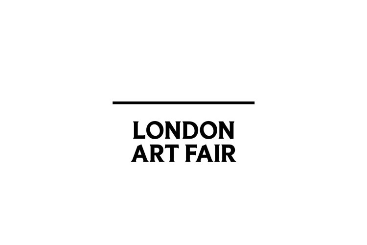
The new logo, which is “toned down” compared to its predecessor, represents a “plinth”, according to the studio, referencing the idea that the fair is a platform for art.
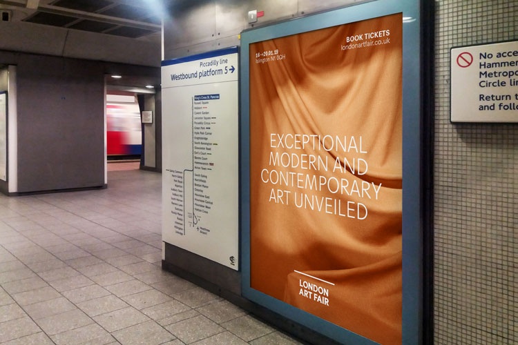
This idea is further reinforced by the positioning of the logo at the bottom of print materials, sitting underneath other content that it is “holding”, such as photography of art pieces, or copy on advertising posters.
As well as the logo, the studio has worked with photographer Amy Currell to create the imagery and video content that features in the advertising campaign for the 2019 fair. The campaign is centred around three backgrounds, featuring different types of folded fabric in green, pink and light orange.
Each has a different texture and also appears as animated versions; each fabric moves in a variety of ways, rippling and swaying.
This imagery centres around the concept of “an anticipation of the reveal”, according to the studio, with animated and static versions of the fabric that look like curtains about to be pulled back to unveil pieces of art.
The three different materials in the campaign allow the branding to express “a range of personalities”, in a bid to appeal to various audience groups that attend the fair, Coombes adds.
For example, the “luxurious” green fabric will be used for communications for the more traditional side of the fair, Coombes says, while the shiny, pink, Latex backdrop will be used to “capture the fun and experimentation found within the more contemporary Art Projects area of the fair”.
Agipo, a sans-serif typeface by Radim Pesko, is used as a core type. It has been chosen to contrast the more “traditional” logotype and because it is strong enough to overlay imagery, Coombes says.
The overall aim of the rebrand is to “celebrate the art”, says Studio Thomas, while also creating a space for changing content to keep the fair “feeling fresh”.
The branding is being rolled out across all touchpoints, including posters, marketing materials, social channels and on the London Art Fair website.
London Art Fair runs from 16 – 20 January 2019, at Business Design Centre, 52 Upper St, London N1 0QH.

-
Post a comment


