Pallant House art gallery’s new branding celebrates its past and future
The Chichester-based art museum has been given a new identity by Studio Sutherl&, centred around a “P” monogram that looks to hero the various collections from 1900 to present that are found there, and make it more “open” to the local community.

Studio Sutherl& has rebranded the Pallant House Gallery, with a new logo that looks to highlight its historical and contemporary exhibition spaces and celebrate its mix of art styles and eras.
The Pallant House Gallery is based in Chichester, West Sussex in the South-East of England, and was founded in 1982, holding collections of art dating from 1900 to today.
It sells itself as a “collection of collections”, taking pride in how it has many sets of artworks donated by collectors, rather than only individual pieces. It is comprised of two buildings, one which dates to 1712, originally built as a townhouse, and another “contemporary” wing that opened in 2006.
Its collections “trace the history of Modern British art”, according to the gallery, and include works and exhibitions by the likes of Tracey Emin, Henry Moore, Peter Blake, Cathie Pilkington and Eduardo Paolozzi.

Studio Sutherl&’s new branding for the gallery looks to unite the two buildings, one old and one new. The logo consists of two bracket characters, one a square bracket and the other rounded, placed next to each other to create a “P” character. This sits alongside the full name of the gallery, set in a bespoke version of sans-serif typeface Akzidenz-Grotesk, set underneath the round bracket.
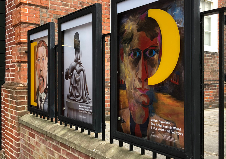
These two brackets open to be used as a framing device for different graphics, photography and text. Incorporating keyboard characters (brackets) aims to make the logo easy to recreate as it can be typed out, says Jim Sutherland, founder at the design studio.
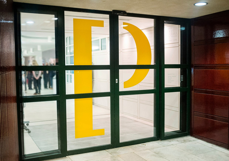
This “editorial” logo device has been used across the gallery; it sits on the entrance’s sliding automatic doors, separating as visitors walk through, and features on picture captions next to artworks and posters around the space, where the square bracket is used to open a sentence and a round one used to close it.
The two brackets aim to represent the “duality of old and new, of the two buildings joined together”, with the round one representing the old wing, as “this is a more old-fashioned shape”, and the square one representing the new, “modern” wing.
By using the logo as a holding device for other content, this also looks to emphasise the gallery’s ethos as “a collection of collections”, says Sutherland, as it physically collects art within it.

The core colour palette has also been informed by the gallery’s art. Four sets of colour pairs were chosen, based on colours taken from particular paintings in the collection. The design team colour-picked from paintings by eye, then used digital tools to find the exact shades.
Complementary colours were paired together, and named after paints, for example alizarin red has been taken from Christopher Wood’s China Dogs in a St Ives Window, and cobalt turquoise comes from Graham Sutherland’s Thorn Head.
Akzidenz-Grotesk is used as the main typeface throughout, but has been refined to give it a “modernist, mid-20th-century feel”, says Sutherland.
By centring the brand around the mix of contemporary and historic features, the rebrand aims to “attract more people” to the gallery, “whether young or old, wealthy or not”, he says.
“Over the last 10 years or so, [the gallery] has become much more open and much less elitist,” he says. “Since the modern extension opened, there is lots of space for communities and school groups to come in. There’s a lovely mix between modern and old art: there’s something for everybody. We wanted to make it appear more open and more distinctive.”

Studio Sutherl& is also currently working on the branding and graphics for an expansion project at the gallery marking its 40th anniversary.
The Coach House Project will see a new building created to store archives of art, which will also be an exhibition space that aims to engage young people and the local community, according to the gallery. It is due to open in 2022 but a campaign and programme of events advertising the new space starts in 2019.
The studio has played with the gallery’s branding for the campaign, reversing the round bracket in “P” to create a “C” character, as a way of “reinforcing the masterbrand”, says Sutherland.
The Pallant House Gallery’s new branding is currently rolling out across all touchpoints, including print and marketing materials such as posters, merchandise, interiors and graphics in the museum, the website and social media. Studio Sutherl& is currently working on a full wayfinding and signage system.


-
Post a comment


