Pantone’s colour of the year for 2015 is… Marsala
Pantone has named its colour of the year for 2015 as 18-1438 Marsala, which it calls “a naturally robust and earthy red”.

The colour has been chosen as it will “enrich our mind, body and soul, exuding confidence and stability” according to Pantone Colour Institute executive director Leatrice Eiseman.
Eiseman says: “Much like the fortified wine that gives Marsala its name, this tasteful hue embodies the satisfying richness of a fulfilling meal while it’s grounding red-brown roots emanate a sophisticated, natural earthiness.
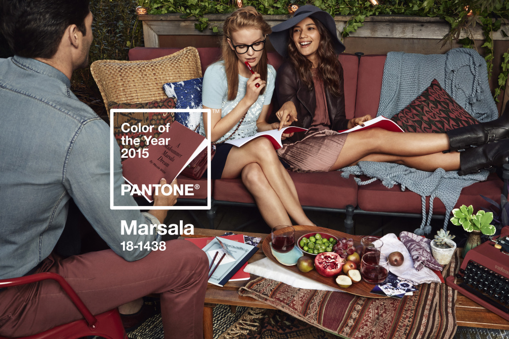
“This hearty, yet stylish tone is universally appealing and translates easily to fashion, beauty, industrial design, home furnishings and interiors.”
Pantone claims that in graphic design Masala will prove “eye-catching but not overwhelming” and that consumers would be drawn to the colour.

Pantone sees that as packaging becomes increasingly more artistic, Marsala will work well on high- and low-tech materials, particularly periodicals and printed material like calendars and stationery.
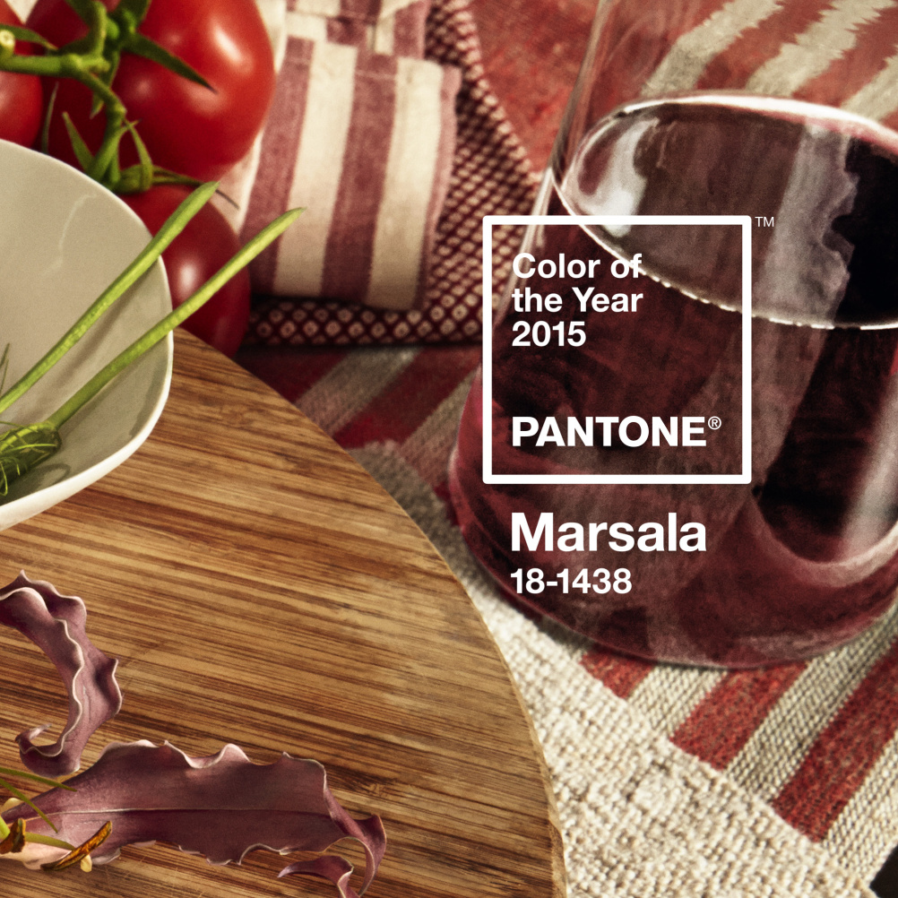
For interior design Masala will prove “complex and full bodied without overpowering” and has the ability to unify interior spaces by adding elegance through paint and accessories.
Pantone says when the colour is enhanced when applied to textured surfaces making it a good choice for rugs and upholstered furniture.

Last year’s Pantone colour of the year was 18-3224 Radiant Orchid.
Read this next


This is a beautiful color which nature already created about 200 million years ago. There a wonderful marbles, limestone and onyx from all over the world which are bearing this warm red tone. One perfect example is Breccia Diaspro a stunning natural stone from Sicily.
I agree with Stefani. Mother nature is already producing great products and inspiration in this colour so why to embrace it and get it into our homes!