Pentagram partner Paula Scher on working from ‘an opposition to something’
‘An initial disdain for the project frees me to overcome what I hate about it’, says Pentagram partner Paul Scher.
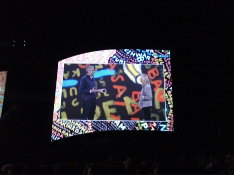
In an engaging talk at the Adobe MAX conference, Scher runs the audience through projects that seem initially uninspiring, proving that it’s often the projects that seem impenetrable – even dull – that give her the most satisfaction as designer.
She tells us her best work is borne from ‘an opposition to something’.
‘I have to find things I don’t know how to do or don’t like’, she says. ‘An ugly environment no one wants to work on becomes the best job in the world. No competition.’
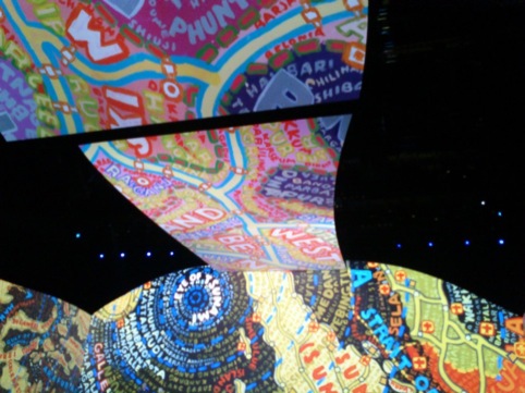
Speaking about a mural she was tasked with creating for a school in Queens, New York, she says, ‘My insecurity as an artist forces me to marry art and design.’
The project saw her create a colourful piece based on hand typography, showing the street names in 20 languages to represent the multiple tongues spoken in the area. The result is a beautifully anarchic, vibrant piece, which she admits was created with the not-so-reliable help of Google Translate.
One of the most fascinating projects she shows us is a perfect example of how red-tape and seemingly frustrating restrictions can produce some of the cleverest design solutions.
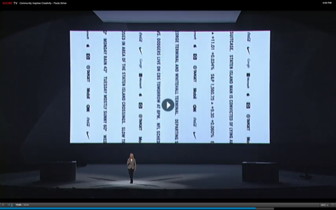
Working for a new shopping development in Staten Island, New York, Scher was tasked with creating as space on which to display the names of the brands it houses. However, New York City planning restrictions mean the space is only allowed to display 500 sq ft of electronic signage.
In a hugely clever move, she created a series of thin, vertical black and white strips, which use LED lettering to display the names. In total, the strips cover 499 sq ft.
‘You have to challenge something a little bit to raise the stakes’, she says.
Read this next

-
Post a comment


