The 5 biggest exhibition stories of 2018
Design Week’s most popular pieces on illustration and design exhibitions from the past year, from shows on protest poster graphics to place branding.
Penguin Essentials at 20: how the publisher rewrote the rules of book design

Our story about the Penguin Essentials 20th anniversary show at the Ditchling Museum of Art + Craft was the most-read exhibition article of the year. The collection, which was on show until April, included covers of classic books redesigned by an eclectic range of illustrators, designers, graffiti artists and more, as chosen by Penguin art director John Hamilton. We spoke to him about the impact the collection has had over the years and how he picked out 100 covers to showcase. He told us one of his personal favourites is a piece by Banksy reimagining the cover of And the Ass Saw the Angel written by Nick Cave from 15 years ago, which features the Penguin logo “breathing fire”.
What to see at this year’s London Design Biennale 2018

This year’s event at Somerset House urged designers from more than 40 different countries to respond to the theme of Emotional States, offering a glimpse at the various ways people around the world think in a bid to encourage understanding and empathy of others. These ranged from the light-hearted, such as the USA’s depictions of facial expressions, to some more serious offerings, such as the UK’s look at the impact of post-war terrorism in Iraq. Design Week’s top picks from the fair included Norway’s contribution, an artificial intelligence (AI) robot which can take a child’s place in a classroom if they are ill, allowing them to see and hear what is going on and even ask questions.
Hope to Nope: the exhibition exploring the power of graphics in politics and protest
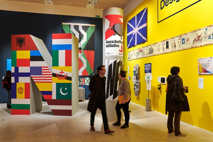
The Design Museum’s Hope to Nope exhibition, which looked into protest art, political graphics and campaign posters led to one of the biggest controversies of the year in the design world. The display featured a wealth of powerful images, illustration, art and poetry, with everything from the widely known Barack Obama, Hope, poster by Shepard Fairey, to graphics used in marches following the terrorist attack at the Charlie Hebdo offices in France. But what began as an exhibition of protest became a scene for protest, as around a third of contributors asked for their work to be pulled from the show after the Design Museum hosted a private event by arms company Leonardo. In a letter, 30 exhibitors said the museum’s actions were “hypocritical” and at odds with the exhibition’s values, although The Design Museum said it had not endorsed the private event. The artists who pulled their work went on to exhibit it in an alternative show called Nope to Hope: Art vs Arms, Oil and Injustice, which was launched as part of London Design Festival.
I ♥ New York, Stockholm and Chattanooga: how to brand a city

Creating a brand identity for an entire city is no easy task, but this exhibition looked at exactly that. Elli Stuhler and Patrick Eley from Place Press publishing house, which curated the City Identities exhibition, looked into the stories behind some of the logos that tried to capture the essence of a city. These included the I ♥ NY marque, which was created by Milton Glaser as part of an advertising campaign when the city was “at its most dangerous” and has since been used in other cities around the globe in various guises. Chattanooga, an up-and-coming “technology hub” in Tennessee, also featured in the article, thanks to the invention of a custom typeface, Chatype, that was made free for anyone in the city to use.
The long-lost suffrage protest posters used to fight for women’s rights

In a year that marked the centenary of women over 30 being given the vote, this exhibition showed a range of previously unseen posters depicting women’s fight for equal rights. The show was based around images discovered in a box mailed to Cambridge University Library in 1910, which was opened more than 100 years later, and found to be filled with political posters. From shocking illustrations of women being force-fed in prison as a response to hunger strikes, to less alarming images of women from various economic backgrounds campaigning for equal treatment, the show offered a glimpse into how design and graphics tried to capture injustice in the early 20th century. Including graphic depictions produced by radical suffragettes and less extreme groups, the fight of many different women was encapsulated in this show’s artwork.

-
Post a comment


