
The Atlantic magazine redesigns in a bid for “elegance and urgency”
The publication – based in Washington, D.C.,US – has unveiled updates across its print and iOS offerings.
The Atlantic magazine has been redesigned, with a new logo, typeface and guidelines for cover design. There are also updates to its recently-launched iOS app.
The 162-year-old magazine is published ten times a year and covers contemporary social, political and cultural issues with a variety of guest writers. The December issue features Lin-Manuel Miranda, Tara Westover and former Secretary of State James Mattis.

Jeffrey Goldberg, the magazine’s editor in chief, says the update is an attempt to reflect the magazine’s “boldness, elegance, and urgency”.
The design has been carried out by the magazine’s design team, headed by creative director Peter Mendelsund and senior art director Oliver Munday.
“We’re just iterating on some level”
In an interview with Goldberg, Mendelsund says that he was inspired by the publication’s century and a half-long history.
He says that the magazine’s first cover had a “seriousness of purpose and mission”, brought out by its pared-back, text-focused design. This “forthrightness” has inspired the new update.
Mendelsund also says that magazine’s adaptability — between 1929 and 1949, it was redesigned five times — “alleviates” some of the pressure on the design team.
“We’re just iterating on some level,” he adds.
New logo and typeface
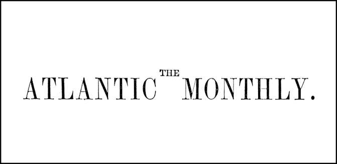
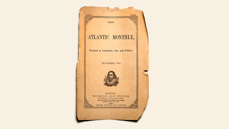
The most obvious change is a new logo, in the top right of the cover. The previous nameplate — ‘The Atlantic’ written out in full — has been present for the magazine’s history.
It has been replaced by a “simple and declarative” single letter: A.
Mendulsund says that this wordmark can be easily applied to digital platforms such as the magazine’s website, mobile devices, and social media platforms.
As a nod to the magazine’s past, its established date is also included on the updated cover.

A bespoke typeface, Atlantic Condensed, has been created, which is inspired by the original type chosen by the magazine’s creators for the first issue in 1857.
Mendulsund describes the serif typeface as an “extremely legible, classical kind of typography” which also “transmits a certain kind of vehemence and urgency that works nicely for our contemporary purposes”.
A “time-released design”
The December magazine is the first issue featuring the redesign. The cover is pared back, emphasising text and striking visuals, without a series of graphics and images.
Speaking about the first cover of the redesigned publication — featuring a single coverline ‘How to Stop a Civil War’ — Mendulsund says that he wanted to convey the “notion of the nation itself”.
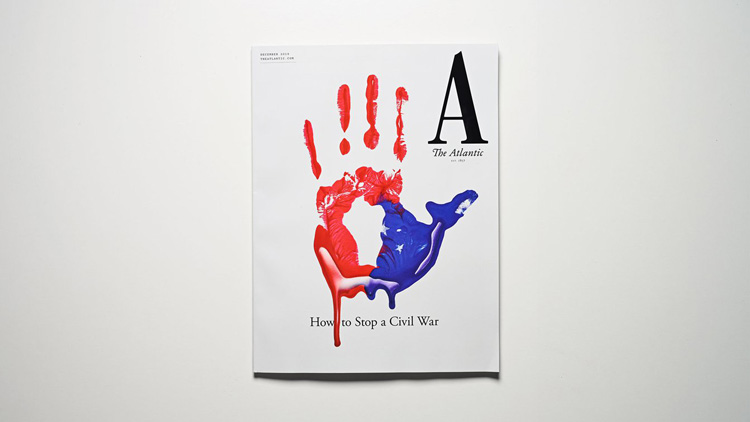
It features a painted handprint, in the colours of the American flag, which also resembles a map of the United States.
“My favourite kind of design is a kind of time-released design, where you look at something and you have an immediate impression of it, and then you, upon further reflection, find something in the design that adds to or subverts that first impression,” he adds.
Nautical ecosystem
The magazine’s colophon – the engraved emblem which forms part of a publication’s nameplate — has been in use since 1910. It has always been the figure of Poseidon; the god of the sea is a useful “nautical signifier” for the Atlantic magazine.
Building on this imagery, Mendelsund created an expanded ecosystem of nautical emblems including a lighthouse, seagull and anchor. These emblems can be used as a “visual interest” on the printed page as well as the website, he says.
App redesign

The Atlantic’s iOS app launched earlier this year — the magazine says that September and October attracted a record number of subscribers. The app offers a daily selection of curated news and features for users.
This app has also been updated, with new features such as offline reading, ad-free and Dark Modes and the ability to do the crossword in-app.
There are also “whimsical visual cues” throughout, according to the magazine, such as handwritten greetings. When read late at night, for example, the app asks, ‘Still awake?’
-
Post a comment


