Will Mastercard’s new nameless logo become the next Nike swoosh?
Michael Johnson discusses whether the new branding, which drops the Mastercard name and keeps only its two red and yellow circles, will work better online or simply turn out to be a minefield of confusion.
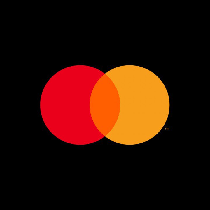
It’s only been a week since Mastercard grabbed January’s branding headlines by taking its name off its logo and distilling the brand down to two interlocking circles. But there’s already been quite a bit of controversy.
Here in the UK, the Daily Mirror has tried to suggest that there has been a “furious backlash” and eagerly reported the Twitter trolls who claim that “Mastercard has trademarked the Venn diagram”. Meanwhile, in the US, Pentagram partner Michael Bierut (who worked on both the 2016 refresh and this “removal”) has proposed that Mastercard now joins an elite group of symbol-only North American companies, namely Apple, Target and Nike.
John Venn’s work is out of copyright, but the latter is quite a serious claim. It helps, of course, that both Apple and Target have straightforward, literal symbols that effectively make their brand names redundant. But for others, dropping a brand name for just their symbol is an inexact decision based on marketing spend, recognisability — and a healthy dollop of “well, here goes”.
“Mastercard has taken the plunge into namelessness”

It’s not a strategic move that will have been taken overnight. Nike took nearly 25 years before deciding to use the “swoosh” symbol on its own. Amazon has only recently, after nearly 20 years of its current logo, started loosening the rules around its arrow as a stand-alone branding device, as seen in its 2018 Christmas advert. Shell, perhaps ahead of the curve on this, still took the best part of 90 years to remove its name – presumably deciding that one, simple, illuminated icon was all that was needed to be spotted from half a mile away.
Now Mastercard, after 50 years and with apparently 80% symbol recognition rate, has also taken the plunge into namelessness. And, if we put the hype to one side, there are many good, practical reasons. Having once been named Master Charge, the company later changed to Mastercard – but in the foreseeable future, physical credit and debit cards may well become redundant. This would certainly help the case for change.
Until quite recently, Mastercard wrote its name within the circles, which acted as a form of container for the type. Bierut’s first move was to decouple the type and put it below the circle symbols, in the currently fashionable, lowercase sans-serif style. Much simpler on paper, but what wasn’t going away was the issue of how a three-colour symbol and a ten-letter name would always struggle at small sizes. The likes of Visa (just four letters) and PayPal (six characters or a “P” symbol) were probably winning the recognition battle.
Keeping an eye on potential copycats will be “critical”
Symbols such as these operate in impossibly tiny spaces: social media icons are 48 pixels wide and the tiny image at the top of a web page (called a favicon) is just 16 pixels wide. On payment pages and app screens, things can get smaller still. This is precisely why so many brands have “truncations” or monograms of their brand assets, like Google’s “G” or Facebook’s “F”.
Compared to the previous marque, the new nameless Mastercard logo is simpler, and definitely easier to use. That’s not to say it’s going to be a walk in the park. The company’s symbol is trademark registered in over 20 different categories worldwide and there are, of course, plenty of other marks using circles. So that “TM” (trademark) will be critical, as will an eagle-eyed legal team to keep asserting that the red and orange orbs remain obviously different to Flickr’s two dots, or Google’s four, for example. (It looks like that intersection – the overlapping style of the circles – is, quite literally, everything).

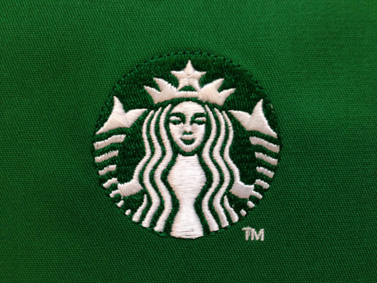
Quite when the name will appear and when it won’t is probably being looked at as we speak. And someone, somewhere, will be puzzling over the black and white version. But just as Coca-Cola can increasingly be summed up by its ribbon symbol, and Starbucks by that winking green mermaid, this is another example of how distinctive and ownable the “core” visual assets of a brand can become. Yet those that start from scratch – such as Airbnb’s much discussed heart/genitals symbol – remain few and far between. Most, like this one, are carefully re-tooled over decades in gradual, evolutionary steps.
To any designers reading this, you may well be designing a critical brand asset on your screen. It may, in time, sum up a global brand in the flash of an eye or the swipe of a screen. But it just may take 50 years for everyone to agree with you.

Michael Johnson is founder at design studio Johnson Banks and author of Branding In Five and a Half Steps.
Read this next


Pretty certain if I gave a client this I’d be laughed out of the office… It’s a venn diagram.
Devoid of character and personality.
If you were to show Target’s identity outside of the US, you’d have a puzzled outcome. It’s entirely based on ubiquity; throw enough money to plaster a symbol and name across various media for countless years and it will inevitably become ingrained in the public’s conscience, scale it up globally and you can start laying claim to shapes and even colours, as with the failed case of Cadbury’s purple. It’s not particularly new, christianity has used a cross as their logo for centuries.
Will Mastercard’s new nameless logo become the next Nike swoosh?
In short. No.
Pretty #useless in France. Never works