
Visualising the invisible: how medical illustrators help us understand viruses
The world’s understanding of the coronavirus has been shaped by the creativity of medical illustrators – here’s how they do it.
The cutting edge of virology and disease control isn’t necessarily where you’d expect to find a team of dedicated graphic designers. But as the coronavirus proves, medical illustration is a crucial weapon in the arsenal of public health officials.
As a profession, medical illustration is a relatively recent phenomenon, having been popularised largely in the last 150 years with the adoption of modern medicine. But as a practice, the combining of art and science is as old as medicine itself.
In the context of the COVID-19 crisis, medical illustrators in teams around the world have been working to provide both scientists and the public with a sounder understanding of what the planet faces.

The “poster image” of the pandemic
Among the many depictions of the virus, there is one that has undoubtedly become the “poster image” of the pandemic.
The image in question came from the US’ Centers for Disease Control and Prevention (CDC). It depicts the virus as a spiky globe, covered in triangular red masses and more sparse orange freckles. Even out of context of the global pandemic, it looks menacing.
To the unknowing eye, it could easily be a computer-generated image – but in reality, the now-famous visualisation was the work of two medical illustrators: Alissa Eckert and Dan Higgins. Work began on the image almost immediately as the CDC began establishing emergency operations in the early stages of the pandemic.
“Everything at the time was all being formulated at once – resources, branding, messaging – and the image was just part of the package,” Eckert tells Design Week.
Like all her medical illustration work, Eckert says the intention with the coronavirus image was to create something “tangible” to help people understand. That the image would be adopted by countries around the world as the veritable face of the virus was not intentional, but she emphasises that her illustrations are always designed to “cut through the noise”.
“We knew that what we produced would need to fight for attention on the news and on social media – so we made sure that what we produced would stop someone scrolling through Facebook in their tracks,” she says.
Conceptual image of the #WuhanCoronavirus based on TEM of 2019-nCoV and spikes based on the related MERS #coronavirus. https://t.co/fAy6dfcsQFhttps://t.co/MpVlBiizC7 pic.twitter.com/dDKYaXiM95
— Melanie Connolly (@Mecovisuals) January 29, 2020
“Wrong or inaccurate can be dangerous”
As with all medical illustration work, the coronavirus visualisation was the product of a multi-step process which began with extensive research and scientific input.
Eckert began the process by researching what was already known about the structure of the novel coronavirus – as a known virus there was, in essence, a “template” for how it should look in regard to the protein structures that covered its surface.
Eckert’s team found these proteins in the World Protein Data Bank, an international repository of information on the 3D structure of biological molecules, and they were able to pull them through into visualisation software. From here, the design goes through an optimisation programme, and then a 3D visualisation software. A post-production programme is used for finishing touches.
At every stage, accuracy is the ultimate aim of the job, Eckert emphasises.
“Wrong or inaccurate can be dangerous,” echoes Melanie Connolly, the medical illustrator behind MeCo Visuals and one half of the Chicago Medical Graphics team. “But at the same time, especially now, you have to work with the acceptance that what you believe to be right might be proven wrong in a couple of days – staying up to date with what is being tested, researched and discovered is necessary.”
To make sure they are up to this task, medical illustration students are treated much the same as medic peers. In her own degree in biomedical visualisation at the University of Illinois at Chicago, Connolly explains that she would take classes with those training to be doctors.
“We had to go into cadaver labs and dissections, because you need to be aware of what you’re going to see later on in your career,” she says.
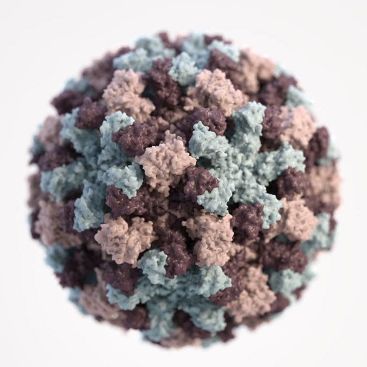
Recently-updated rendering of SARS-CoV-2 #coronavirus. Includes numerous M surface proteins, a few E pores, & several large trimer S spikes. I chose to separately color the S spike chains to emphasize #3D relationships. The bottom right spike is ready to bind! #COVID19 #sciart pic.twitter.com/gadwh6NoWs
— Melanie Connolly (@Mecovisuals) March 23, 2020
“You have to think about who you’re trying to teach”
Armed both with their own medical experience and that of the scientists they work with, Connolly says the key first step of any project is the consideration of the audience.
“You have to think about who you’re trying to teach,” says Connolly. “If you’re trying to teach a patient what their spinal surgery is going to look like, that is very different from trying to teach the surgeon how to do it.”
Once medical illustrators have their audience pinned down, it’s a case of adapting style and format accordingly, Connolly continues.
“A lot of the time for public health messaging, you’re just trying to get people to look at something for a little bit longer than they want to – and you do that by making something look pretty, or eye catching or bold, because once they’re interested they’re more likely to learn.”
Eckert echoes this, giving the example of the CDC’s work visualising the Ebola virus for resources for use in affected African countries.
“There are lower literacy rates in Africa, but more than that we quickly found that the style of medical illustration used in the US just didn’t adapt well to audiences in African countries,” she says.
“We had to completely change our style to suit what the public were used to seeing, so that they would trust the imagery we were putting out there,” Eckert continues, explaining that what people consider as good advice can be subjective. “You don’t want it to be playful, because people won’t pay attention to it.”
“The work being done is really innovative stuff”
But for all the training and expertise that goes into the craft – both scientific and creative – the profession is, regrettably, relatively unknown. As Connolly points out: “Most of the clients I take on have never worked with a medical illustrator before and have only recently heard they exist.”
“It’s one of those things that, especially now, people will be seeing a lot of without really thinking about the processes behind it,” says Debbie Maizels, honorary secretary at the Medical Artists’ Association of Great Britain (MAA). “But actually, some of the work being done by medical illustrators is really innovative stuff.”
Having worked as a medical illustrator for 25 years, Maizels says the profession has diversified and developed in line with technology. While many continue to succeed with more traditional illustrative mediums, others are working at the cutting edge of innovation.
“Within the MAA, we have members who are working in 3D visualisations, cartoons and even virtual reality simulations for surgeons that give realistic haptic feedback.”
In the same vein, the technology that exists within the wider publishing community means the process of medical illustration is speedier than ever.
“Before journals were online, the process of researching, creating and getting approval could take weeks, never mind the time it took to print,” she says. “But in the last few weeks, for example, I have been creating coronavirus-related illustrations for journal clients that had a 24-hour turnaround time.”
As the medical illustrators of the world scramble to provide a “face” for the coronavirus, Maizels ends: “Ultimately, our job is to make sure everyone can understand what is being said, regardless of their background.”

-
Post a comment


