
How Coley Porter Bell is repositioning the Tesco Finest range
As part of a packaging refresh of more than 1000 products to “celebrate every detail”, Tesco Finest coffee features bespoke illustrations that nod to each coffee’s origin.
Coley Porter Bell has redesigned the packaging for Tesco Finest coffee products, combining new bespoke artwork alongside the range’s recognisable silver hue as part of a wider range refresh.
Coley Porter Bell has been working on the Tesco Finest range in partnership with the Tesco team for five years and will continue until all its Finest category packaging has been refreshed.

Since its launch over 20 years ago, Tesco Finest adopted a “one size fits all approach” to the design, which was “restricting the telling of the individual product details”, says Coley Porter Bell creative director Sam Stone. She adds that the Finest brand was “the first supermarket own label to introduce a premium tier” but, as competitors followed suit, its look became “predictable and indistinguishable” from other retailers.

She explains that the studio’s approach to creating new brand guidelines was to identify the “fixed and flexible elements of the Finest brand equities” via a tiered, visual hierarchy. Most importantly, Stone says they had to consider how the range could retain “the right balance of silver thread” while also incorporating product specific photography and bespoke illustrations “suited to each category semiotic”.
Presenting the Finest range as affordable luxury was a key focus of the redesign project. This involved “dusting off the traditional codes of premium” to create a product that is both “uplifting and attainable”, says Stone.
While Coley Porter Bell recognised the importance of keeping some visual brand cues in place, such as the silver colour which has been used since the brand’s conception, Stone says the studio noticed its over reliance on “classic codes of black with touches of metallics and scripted fonts”. After reinstating the “silver thread of equity” to work alongside a new style of bespoke food photography, the studio integrated an existing Tesco-designed and -owned serif font onto the packaging, Stone adds.
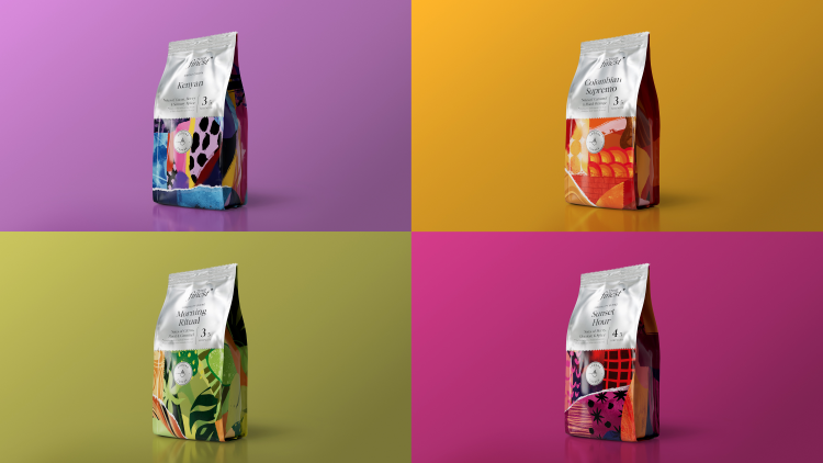
For the Finest coffee range – which includes six different flavours – Coley Porter Bell started by looking at competitors across the category. Finding that the space is “dominated by many more specialist and artisanal brands”, the studio set out to amplify the “origin and the uniqueness” of each product flavour on the packaging, Stone adds.
Designer and illustrator Tom Abbiss Smith is responsible for the Tesco Finest coffee artwork. He was chosen for his accessibility as his “hand-crafted” style can be interpreted as “vibrant, joyful and colourful” but reveals “certain characteristics and narratives” when analysed in more detail, says Stone.
As well as aligning with Coley Porter Bell’s strategy to make to brand uplifting, the designs also seek to illustrate how each coffee flavour was created. Stone says that Abbiss Smith’s layered work comprises “subtle references” to the region the coffee was sourced from and nod to each blend’s “unique characteristics and flavour notes”.
The illustrations are enhanced through motion, using the layers to make it look “as if it is being drawn right in front of you on the page”, according to Stone. The motion aims to demonstrate organic growth, paying homage to the coffee’s journey from plant to pod.
Commissioning bespoke illustrations was a method used across other products in the Tesco Finest range, such as the crisps, biscuits and antipasti. As with the coffee, Stone says graphic illustrative system helps to “flex the personality of products within their of individual categories” while capturing each product’s “craft and flavour”.
Stone says: “Structural components, tactile finishes and sustainability principles have all been introduced and embedded into new product ranges where possible and affordable.”
As the packaging brand guardians, Coley Porter Bell will continue updating and introducing new products at Tesco. Stone describes it as “a continuous cycle of updates, refreshes, and new product launches”, which ensures the Finest brand can compete with other premium brands as well as keeping up with “the constantly evolving and changing codes of premium”.
Read this next

-
Post a comment


