Frost and Droga5’s OzHarvest food charity identity
Sydney-based consultancy Frost has worked with ad agency Droga5 to develop a new identity for Australian food charity OzHarvest.
Ozharvest is a charity that distributes excess food from restaurants and retailers to charities across Australia, delivering nearly 500 000 meals a month using a fleet of 15 vans.
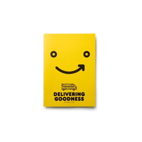
The identity uses images of food items to create a van shape, and the Frankfurter typeface is used, in what the consultancies describe as a ‘cheeky nod’ to the nature of the charity.
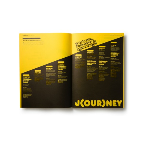
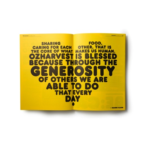
Branding uses the distinctive yellow colour of the vans – as seen in the charity’s annual report, which also features data presented as infographics and text shown as typographic motifs.
Frost and Droga5 say the branding, which was developed as a pro-bono collaboration, is based around the concept of ‘nourishing our country’.
David Nobay, creative chairman at Droga5, says, ‘The concept of “nourish” is part of a journey that will ultimately include the creation of urban allotments, a pop-up restaurant, a new product line and hopefully even a TV show over the next year.’
Read this next

-
Post a comment


