Honeycomb creates J20 Fruit Fusions packaging
Honeycomb has designed the packaging for soft drinks brand J20’s new Fruit Fusions sweets.
Project management company Honeycomb developed the brand as a licensee of Britvic, which owns J2O soft drinks.
It was approached by Britvic to develop the sweets range and design the packaging on the strength of previous projects for Britvic, including work on Fruit Shoots and Robinsons drinks.
The pack designs are based on brand guidelines created by Blue Marlin, which rebranded J2O in 2009, and refreshed the branding again in 2011, when it worked on packaging projects including designing the bottles for a Christmas variant that contained edible gold glitter.
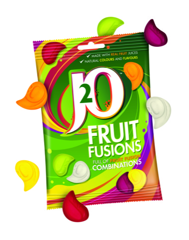
Russell Mitchell, head of the product development team at Honeycomb, says, ‘[Britvic] wanted us to go forward with the J2O brand, but obviously you can’t just use a slavish implementation of a drink on a sweet. We developed the look and concept for the sweets and evolved the artwork to chime in with that, but maintain consistency across the product range.’
The teardrop-shaped gummy sweets slot together to form a whole, which Mitchell says references the idea of J2O as a ‘blend’ that combines two separate elements to make something that tastes better than the individual parts.
‘Consumers don’t take very long to choose, so you have to communicate the message very quickly and as best as possible’, he adds. ‘We tried to pull out vibrant colours from [Blue Marlin’s] style guide, and used a swoosh that feeds in and out of the logo to make it look exciting.’
Fruit Fusions are aimed at an adult market, says Russell, so packaging designs look to create a more ‘premium feel’.


Looks good but I do think of rowntrees fruit gums when I see it .