Alder Hey children’s hospital launches new elephant branding
Alder Hey children’s hospital in Liverpool has launched new branding by USP Creative, centred on an elephant called Oli.
The consultancy was appointed to the project in January this year following a five-way pitch, and was briefed to create a new identity that positioned Alder Hey as the biggest UK children’s hospital.
The new branding is used across two separate entities – the Alder Hey Hospital Trust and the Alder Hey Children’s Charity, and its launch forms part of the preparations for the new hospital, due to be built in 2015.
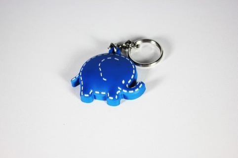
USP Creative created the ‘Oli the Oliphant’ icon aiming to reflect the ‘core values and unique qualities’ of the hospital, according to USP Creative.
Oli’s large ears look to reflect the way the hospital supports and listens to patients, while his smile ‘brings hope to everyone at what can often be a time of stress and discomfort’, says the consultancy.
The felt texture is used to create the feel of children’s games, with hand-stitched seams to represent the care given to the patients.
Pantone 300 blue was chosen as the colour of the Oli icon due to its ‘gender neutral’ and ‘calm, reassuring and confident’ qualities, says USP Creative.
The Oli icon is shown across all touch-points, including the Alder Hey website, fundraising collateral and stationery, merchandise and hospital communication tools.
The branding is gradually rolling out over the next 12 months, and USP Creative is now working on designing a new website for the hospital.
Read this next

-
Post a comment


