Bernard Matthews launches new identity
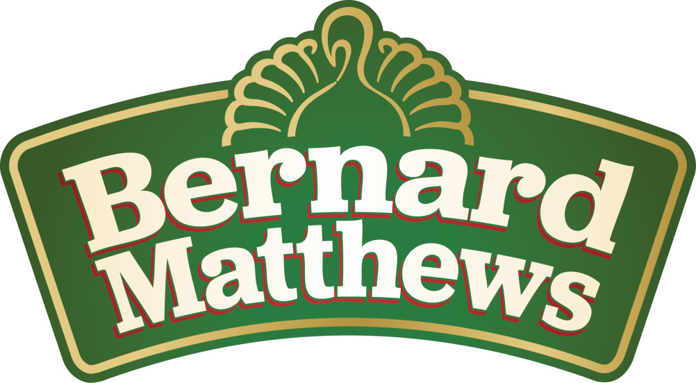
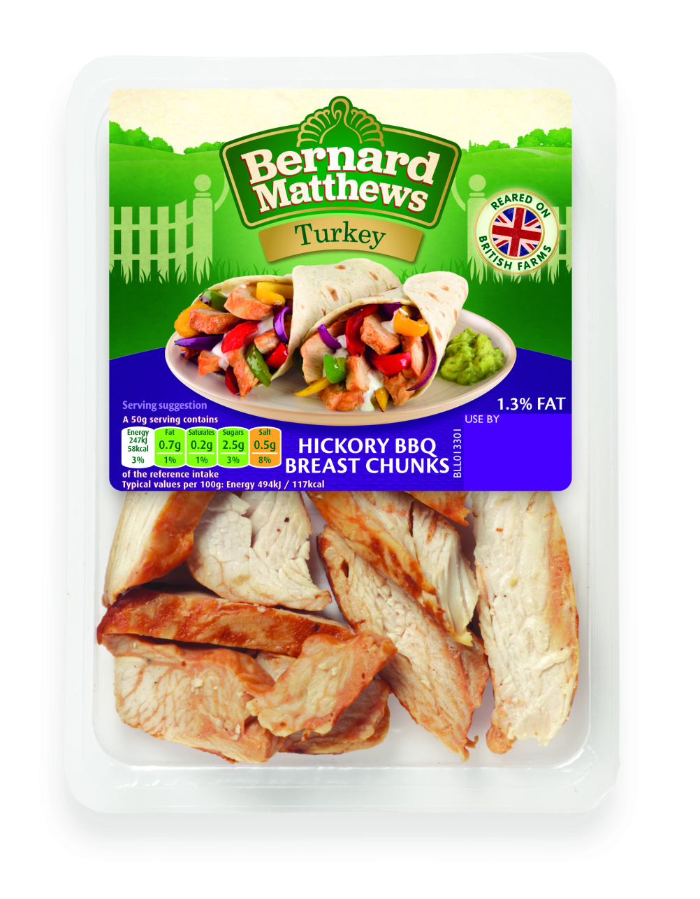
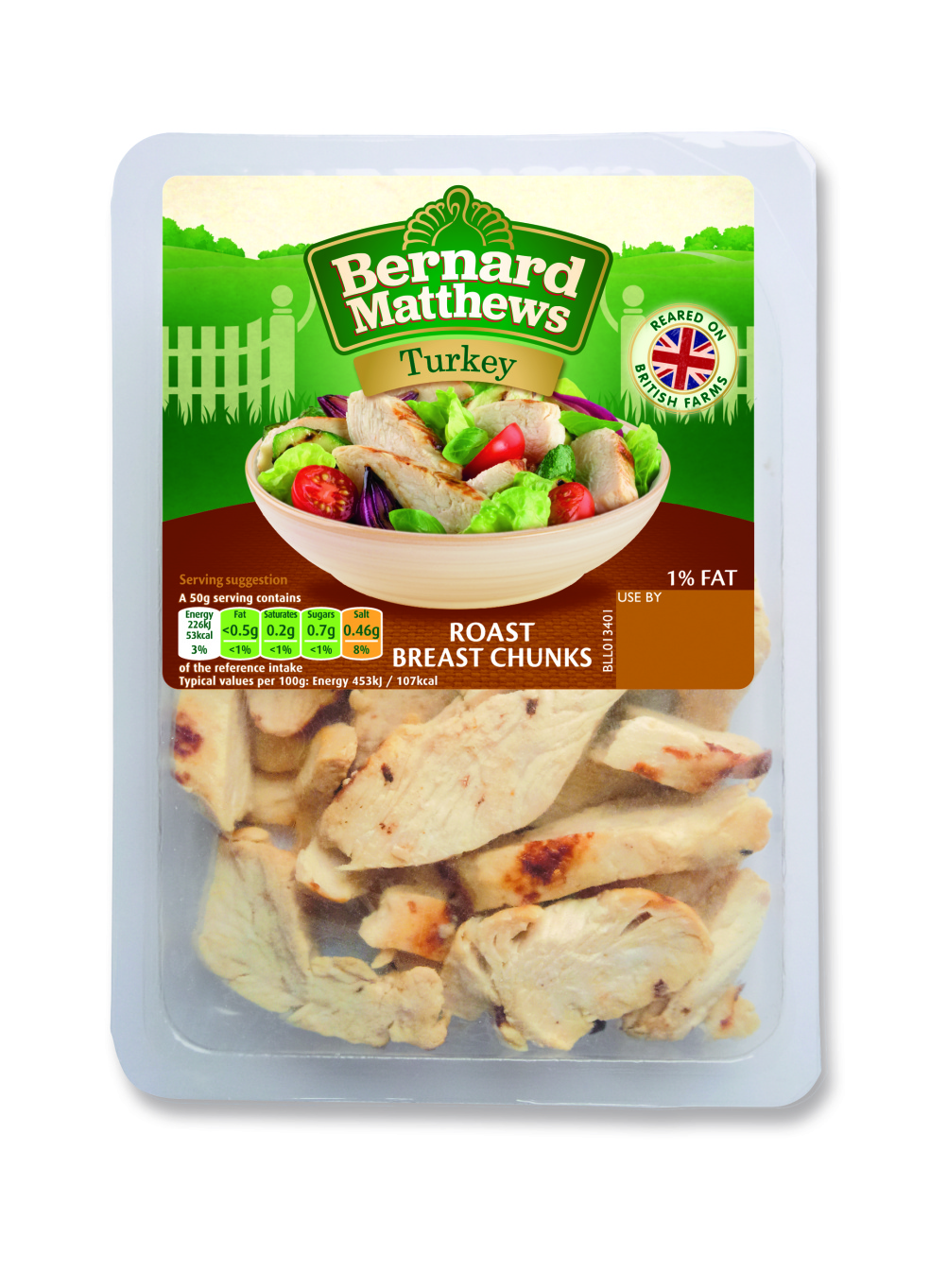
Turkey brand Bernard Matthews is rolling out a new identity, created by Springetts.

The new look aims to be ‘modern and forward-thinking’ while focusing on the provenance of the brand, according to Springetts design director Claire Ganly.
Ganly says, ‘We really wanted to focus on the provenance of the brand – they’ve been around for a long time and everything comes from their own farms.’
The new look carries over a green colourway from the previous identity, Ganly says this was due to customer recognition, and uses farm-gate and signpost graphics.

Ganly says, ‘The farm gates act like a welcome to the Norfolk countryside. Previous packaging has used the Great Witchingham Hall [where Bernard Matthews started his business], but we wanted to just hint at it.’
Deborah Ewan, Bernard Matthews commercial director, says, ‘Our new brand refresh… reinforces our farming heritage and product provenance, something that customers have continually told us is important to them.’
Springetts has been working on the project since last year, and Bernard Matthews says it is launching its new look this month to coincide with the retailer back to school season.

The packaging is rolling out on cooked meats initially, with Springetts currently working on designs for the frozen range, which are set to launch next year.


It looks like the rear end of a dog wearing tutu
Or, the bum of a cartoon lion
Beautiful and safe identity image that appeals!
A curly poo with Beano-esque rotten egg pong waft lines.
Its not very bootiful at all!! – old fashioned and tired photography, and branding barely moved on from the 1970’s. I can’t get the image of the dog’s rear end and tutu out of my head!
Its a poor rip off of the great work done by Brandopus on the McCain range. How is this modern and forward thinking? A great opportunity wasted… to turn around a brand with some negative connotations. I would have expected more from the same agency that did some great work with Happy Eggs etc…
Grim. With such an established brand surely they would be in a unique place to push things on. This is dire.