
Design inspiration: the best projects from February
A 1950s-inspired poster series to fight against the spread of coronavirus, an anatomical typography diagram and a design museum you can take home with you are some of our favourite projects from the past month.
Exhibition: The Swedish Design Museum To Go, by Visit Sweden
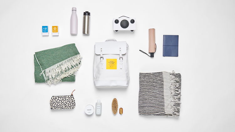
According to Visit Sweden – the country’s official travel and tourism website – blending in with locals is one of the most rewarding experiences for seasoned travellers. To help facilitate this further, the organisation has launched the Swedish Design Museum To Go, an exhibition that encourages you to get hands on with some of its most well-designed exports as a way of exploring the country.
Housed inside a designer backpack from Swedish brand Sandqvist, visitors can have four different experiences depending on where they are in the country. In the east, for example, local curators have filled the backpack to reflect the culture of Stockholm, with tech, textiles and cosmetics. In the west, visitors are given the necessary means to enjoy the Swedish countryside, with a board game, pens and different fashion.
Typography: The Definitive Type Anatomy Diagram, by Graphicacy
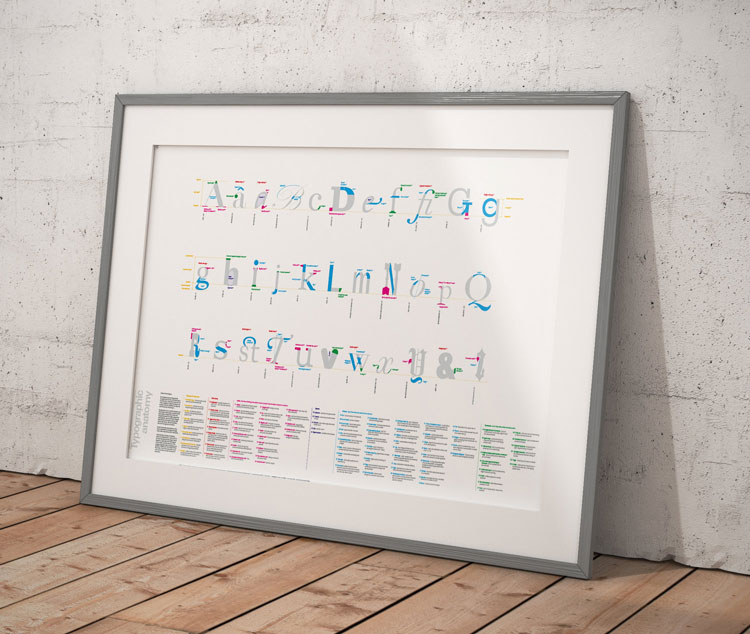
Do you know your hairline serif from your bi-lateral serif? Your taper from your pothook? A new project researched and designed by LCC alumni Benedict Richards and Carolina Scarpetta aims to give you all the typographic knowledge you’ll ever need.
Titled the Definitive Type Anatomy Diagram, the poster contains “all accepted typographic anatomy terminology”, with more than 120 terms in total. Using a colour code, a glossary and a cross referencing system, Richards and Scarpetta have aimed to make the information clear, concise and beautiful, in a way they claim has never been done before. Richards originally created a precursor to the poster as a teaching aid, before developing it into the all-encompassing work it is today.
It comes with this warning: “This diagram is not a toy or decoration and may increase your fascination with letterforms by up to 275%”.
Brand identity: Birds of Prey, by Pentagram’s Emily Oberman
After debuting the character in 2016 Suicide Squad movie, Margot Robbie reprised her role as the DC Comics antihero Harley Quinn this month. And beyond a star studded cast, Birds of Prey and (and the Fantabulous Emancipation of One Harley Quinn) also featured the branding work of Emily Oberman.
Oberman and team created an identity that captured the title character’s “love of mayhem”, including a bespoke typeface inspired by one Harley Quinn herself. The custom letterforms of the movie logo were based on Monotype’s Smart Sans, while the subtitle is intentionally scrawled to “cause chaos”. Alongside the logo, the team also developed the “Prey for Gotham” tagline for the film’s advertising campaign.
T-shirts: Type in Focus, by Everpress
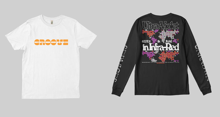
Need another typographic fix? Creator-led apparel manufacturer Everpress has launched a new line of T-shirts celebrating its favourite type designers that might satisfy.
Featuring the likes of Pangram Pangram, Colophon Foundry, the Yarza Twins and Femme Type, the the 40 limited edition T-shirts have been designed by designers from type foundries around the world in response to the theme “emotion”.
According to the Everpress team, the clothing line is about “educating the next generation of type designers, keeping those already in the field inspired and helping fostering connections in the type community”. The T-shirts featured here have been designed by Femme Type (left) and Superimpose.
Poster: Stay Clean, Stay Strong, by JWDK
View this post on Instagram
In the wake of coronavirus, Shanghai-based brand design studio JWDK has launched a series of illustrated posters designed to help stop the spread of the illness. The Stay Clean, Stay Strong posters aim to help employees maintain good hygiene in the workplace in China, as many workers begin to return to their jobs after weeks of working from home.
The design of the posters has been inspired by old Chinese public health posters from the 1950s and features instructions of practices like properly washing hands and wiping down kitchen surfaces. Leaning into the vintage aesthetic, each of the four posters has been illustrated with soft colours, and vertical Chinese type.
According to the team, the messages on the posters echo those laid out by the Chinese government and the World Health Organisation (WHO).
App: Sketch’s David Shrigley AR app, by HATO

Flying in the face of those who say it’s rude to be on the phone at dinner, restaurant-gallery hybrid Sketch has added a new level to visitor’s dining experience.
Developed by London-based design studio Hato, the augmented reality (AR) sketchApp invites diners to “dive into an AR fantasy” by allowing imagery by David Shrigley to break free from its frames on the walls and dance around the room.
There are 15 digital cut outs of Shrigley’s work in total, and users interact by using the digital stickers and “placing” them around the room. Once placed, the stickers animate and interact with the restaurant surroundings, allowing users to take pictures or videos of the AR world.
Prize winners: Design Cubes, by Design Ventura winners Toby, Jemma, Rachel and Amillie
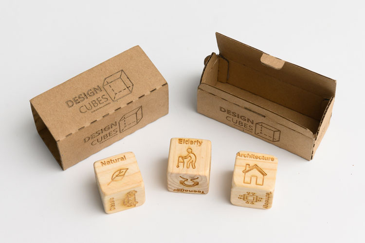
The winning submission to the 10th annual Design Ventura competition, Design Cubes have been created to help designers get over that all too common feeling of creative block.
Along with some 300 other schools across the country, the four winning teenagers from Twynham School in Dorset were briefed by Turner Prize-winning design collective Assemble to create a product that improved an aspect of everyday life for one of three target audiences – families, adult design enthusiasts or young people and students.
Design Cubes is a game to generate ideas, and takes the form of three wooden dice. When rolled, they produce a random set of suggestions for creativity. They will be available in the Design Museum this summer.


I’m a little surprised to see the cubes idea win an ‘award’ is it not essentially an extension this popular kids game? https://www.storycubes.com/en/