
“Even 45 years on it feels futuristic”: The return of NASA’s beloved Worm
The past weekend saw the return of NASA’s well-loved wordmark, after nearly three decades of retirement – to celebrate, publishing outfit Standards Manual have launched a new book.
“It was in February when we got the phone call – they told us NASA were bringing the Worm back and we just sat there thinking ‘Oh my God!,” so says Hamish Smyth, one half of the publishing outfit Standards Manual.
As a self-confessed “NASA nerd”, the news that the US space agency was “un-retiring” its iconic red wordmark – affectionately referred to as “the Worm” – was a big deal to both Smyth and his Standards Manual co-founder Jesse Reed, he tells Design Week.
The rest of the world would learn of the Worm’s return some months after Smyth and Reed did. By this time, the pair were already working on a design project to commemorate the occasion.
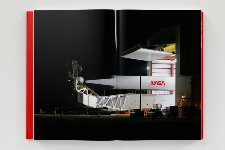
The finished result, a 248-page book that charts the application of the wordmark during its 17-year lifespan, was unveiled last week to coincide with the Worm’s physical return to the public sphere, on the side of the Falcon 9 rocket designed by private spaceflight company SpaceX.
The SpaceX phonecall
This isn’t the first time the Standards Manual team have covered space – indeed their previous work was one of the reasons the pair received the fateful February phone call in the first place. Back in 2016, Smyth and Reed reissued the NASA Graphic Standards Manual, first designed by Richard Danne and Bruce Blackburn in 1974, as a hardcover volume.
Having explored so far into the aesthetic history of the US space agency, when SpaceX needed to know the exact colour with which to paint the Worm onto the side of the Falcon 9, Smyth and Reed were first on the list.
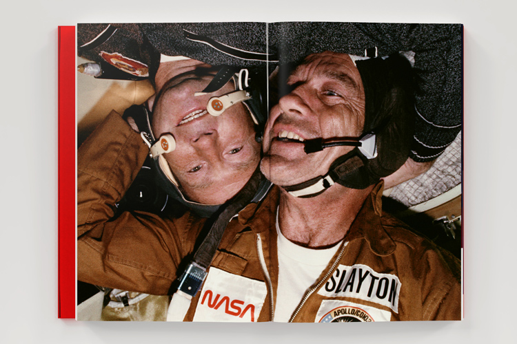
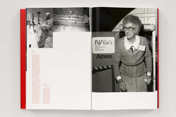
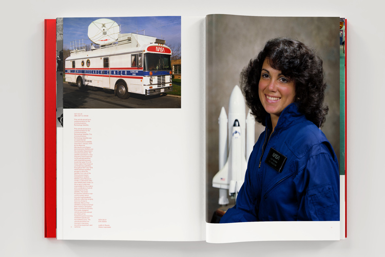
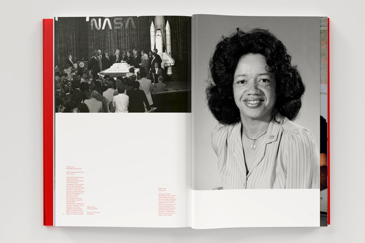
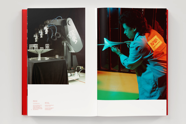
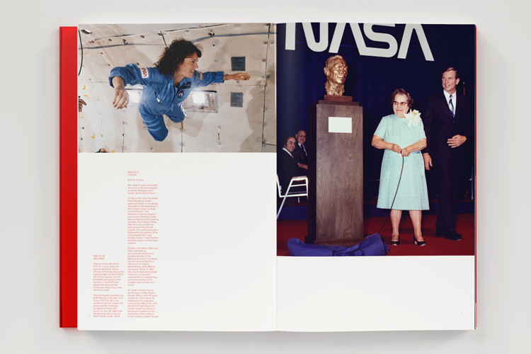
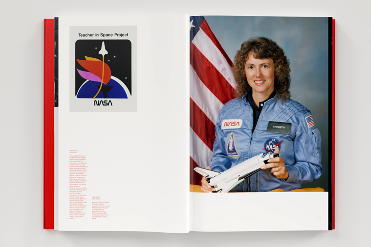
With news that the Worm was on its way back to NASA, Smyth says the pair were “kickstarted” into this new book idea. Wanting to find examples of the Worm in its heyday – between 1975 and 1992 – they started digging in NASA photo archives. From initial stages to the finished product, the process took just eight weeks.
Finding the “quirky stuff NASA got up to during the Worm era”
This was no small feat. Known for its intricate documentation of all operations, Smyth and Reed had tasked themselves with looking through literally tens of thousands of images in search of any that featured the Worm in any form.
“Of course, NASA has lots of images of Worm-bearing aircraft and we have plenty of those pictures in the book,” he says. “But beyond just that, we also came across loads of really esoteric photos of the quirky stuff NASA got up to during the Worm era.”
Through the masses of images, Smyth was able to narrow it down to a longlist of 500. From there, he set about printing and arranging them – first chronologically and then into smaller collections. Because of the coronavirus lockdown in the US, the process was necessarily and gratefully carried out on Smyth’s partner’s parent’s dining room table, he says.
“Hi-tech and space-age”
Of the images that made it into the book – including an unfinished final chapter earmarked to contain images from SpaceX’s rocket launch on 30 May – Smyth says the aim was to present that with the sense of enormity appropriate for space travel.
Having all been taken on film, the high resolution of the images loaned itself well to double page spreads and large prints throughout the book. All images have been positioned to bleed off the page and, to evoke a sense of weightlessness, all have been designed to “float to the top of the page”.
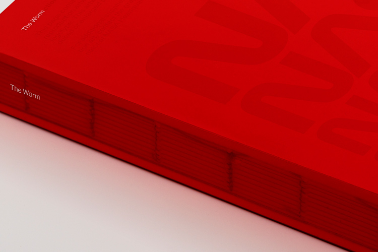
The other desire for the book, according to Smyth, was for it to “feel hi-tech”: “Like the Worm itself, we wanted it to feel space-age.” This has been achieved in part through the use of a “super glossy” paper stock.
The final message the pair wanted to get across in their design of the book, according to Smyth, was the sense of occasion that was the Worm’s return. To do this, the book has been wrapped in a translucent cover the same colour as the logo itself, making the seven wordmarks printed on the paper inside harder to see.
“We did this almost as a little joke for ourselves – the idea is that every time you open the book, that’s the Worm returning from retirement,” he says.
Why the Worm?
At the end of the interview, Design Week asks Smyth just what it is that makes the Worm such a captivating piece of design. There are many reasons, he says.
“For designers, the Worm is just an example of a beautiful piece of design – designers appreciate the thought that goes into its simplicity, like the aerodynamic nature of the letterforms, the ‘As’ that look like nosecones,” he says. “But beyond the design intricacies, what is impossible to miss is just how futuristic it still feels 45 years on – it looks at home on the side of a SpaceX rocket.”
But perhaps the biggest reason people are so eager for its return, Smyth says, is down to pure nostalgia. For many people who grew up during the 1970s, 1980s and early 1990s, the Worm was NASA, and such aesthetic familiarity is exciting.
Was Saturday’s rocket launch the official return of the Worm? Is the wordmark about to usurp NASA’s other beloved icon, the “Meatball”? We don’t know for sure yet.
With this in mind, Smyth says: “I don’t see a problem with NASA using both – it will require a bit of planning to establish some rules, but I think I can happily see a future where Meatball and Worm co-exist.”
The Worm is available for pre-order in the US, Canada and Mexico now, via the Standards Manual website. For UK orders and anywhere else outside of North America, pre-orders should be placed via Counter Print.
Read this next


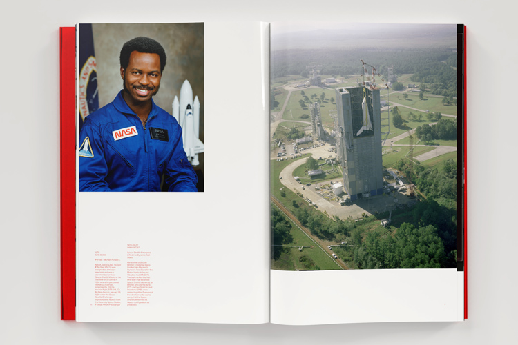
The most beautiful part of this article was the pic of Judy Resnik.