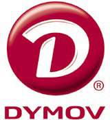
Russian food producer’s logo no v-type due to error
Looking at the Dymov logo (DW 3 February) I noticed the letter ‘V’ is the wrong way round.

Looking at the Dymov logo (DW 3 February) I noticed the letter ‘V’ is the wrong way round.
At first I thought no way could they have missed that one; it must be an in-joke. Then I thought they tried to finish off with a heavy stroke, to create some sort of bracketing. But that can’t be it, because not only does it look wrong, it is wrong.
Besides, if it was done intentionally, the character should have had some balancing done to it. Then I thought this must be a Cyrillic thing. But no, it isn’t either. We have designed Cyrillics and I know what the characters look like.
So, the only explanation is the designers missed that one, which is kind of embarrassing. I suggest if next time a designer is not quite sure which way round a letter goes, to pick up the phone and ask us.
And don’t get me started on the ‘group NBT’ logo (DW 5 February).
Bruno Maag
Managing director, design
Dalton Maag
London SW9
-
Post a comment


