The week in design
Our most-read stories of the week

1. Aesop Agency has designed a personal identity for British tennis player Andy Murray, which will initially appear on his court bag and training T-shirts before rolling out across a range of branded apparel and accessories.
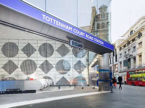
2. A new ticket hall and entrance has opened at Tottenham Court Road Tube station, with interiors that aim to “enhance” the 1980s tile designs created by Eduardo Paolozzi.

Source: William Warby
3. The design sector contributed £3.1 billion to the UK economy last year – a massive rise of nearly 25 per cent from the previous year, according to new Government figures.
Our most popular Tweet of the week
The @NHM_London is trying to find Amanda Taylor who designed this poster as 14-yr-old in 1981: http://t.co/6dFkNDwOoZ pic.twitter.com/1D2jg0gR8t
— Design Week (@Design_Week) January 12, 2015
Our favourite Tweets of the week
“Glitter as a Service” – brilliant http://t.co/YKltcyYqDs, thanks @peterbrowse
— Mike Burgess (@ipad_publisher) January 13, 2015
Brilliant notice in the Tate Britain. Writing on wall uncovered during building work. pic.twitter.com/lOOMamM4ZE
— James Cooray Smith (@thejimsmith) January 14, 2015
Apparently, no-one has won a Spot the Ball jackpot for 10 years! Surely time for a redesign? http://t.co/2tUU0822ms
— Creative Review (@CreativeReview) January 15, 2015
Image of the week
Royal Mail’s new Alice in Wonderland stamps – designed by Godfrey Design – are accompanied by some rather lovely animated Vines.
Quote of the week
“Branding sits at the juxtaposition of commerce, culture, technology and society – all these rich meaningful things. It is as fluid as a mark that people can remember and it is big enough that it can absolutely change what a city or a country is about.” Wolff Olins global CEO Ije Nwokorie gives his thoughts on what branding is and how it has changed over the years.
Our favourite website

Can you identify the city from its Subway sign? There’s a nice quiz on the Guardian.
Design stories in the national press

The Guardian initally didn’t seem to be big fans of Andy Murray’s logo – describing the rationale behind it as “a load of nonsense” and asking readers if they could do better. The newspaper later wrote a more complimentary piece though, saying that the identity had received the “thumbs-up” from fans and marketing experts.
The BBC takes a look at what workers hate about TV representations of their professions. Creatives apparently dislike the Mad Men “genius pitch”.
The golden ratio has spawned a beautiful new curve – the Harriss spiral. The Guardian takes a look.
Read this next

-
Post a comment


