DesignStudio refreshes note-taking app Evernote’s elephant logo
The app, which allows users to write notes on a smartphone or computer in many different forms, has been given a refined visual identity focused on an updated elephant symbol, the colour green and two new typefaces.
DesignStudio has worked with Evernote’s in-house creative team to refresh the branding of the note-taking app, which aims to give it a more “energetic” and “modern” look.
Originally founded by Stephan Pachikov in 2008, Evernote is an app that aims to help users “keep their notes organised”, according to the company. It synchronises memos so they are accessible from different devices, and has a search function.
The app has over 225 million users worldwide, spanning 124 countries. It allows users to create a range of notes in various formats including text, web pages, voice memos, photographs and “handwritten”. It can be used across smartphones and online on a computer.
Having launched 10 years ago, Evernote has become known for its logo of an elephant known as “Mads”. The two design teams decided that the app’s key character would remain but would be refined.

The elephant has turned from grey to the company’s signature green colour, its edges have been softened, its trunk curled into a spiral, and its forehead sloped.
These changes are intended to represent progress and forward momentum, says DesignStudio.
The fold in the elephant’s ear has been increased, which looks to symbolise the folded corner of a document or a dog-eared book.
The same green colour has been used prominently throughout the brand identity, along with a palette made up of lighter green, black, white and grey. The block colours have been textured with geometric patterns repeated throughout.
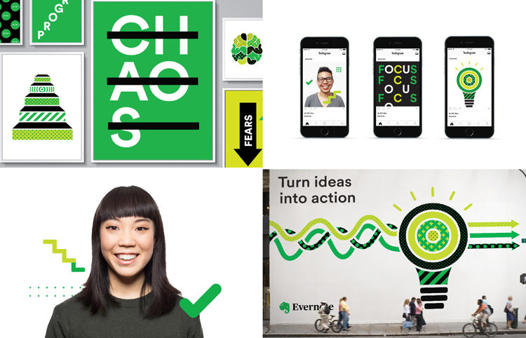
Serif typeface Publico set in 100% black has been used for the logo wordmark, which aims to be “sophisticated” and “timeless”, says Jonathan Woytek, executive creative director at Evernote. This replaces Caecilia, an all-caps, slab serif typeface.
Soleil, a geometric sans-serif typeface has been used as a secondary type throughout Evernote’s brand communications, as Woytek also felt it would work well for typographic art featuring “clever” messages – such as “keep it all in your head” with a strikethrough over the second part of the sentence.
Ty Whittington, creative director at DesignStudio, says: “We worked with Evernote as one team. Through immersing ourselves in the company culture… [this] informed our decision to evolve, rather than reinvent the brand.”
The new branding was revealed in a Medium blog by Evernote this week.


-
Post a comment


