Johnson Banks flies in with EU presidency logo
Johnson Banks last week unveiled its identity design for the UK’s upcoming six-month presidency of the EU, substituting stars for flying swans in an effort to avoid the clichés favoured by prior incumbents.
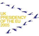
Johnson Banks last week unveiled its identity design for the UK’s upcoming six-month presidency of the EU, substituting stars for flying swans in an effort to avoid the clichés favoured by prior incumbents.
The Design Council oversaw a paid tender between up to four consultancies, having been brought in by the Prime Minister’s office after an initial concept, based on the letters EU UK, was rejected.
The basic logo represents the countries of the EU as mute swans flying in a V-shape, but the elements of the design also exist in animated form and will be adapted for use on a wide range of items, from stationery to cuff-links.
The flying swan formation is intended to represent the mutual reliance of the EU states and the way in which leadership moves from member to member. The birds fly in a V shape – known as a wedge – to minimise wind resistance and conserve energy, and the lead bird in the formation changes on a regular basis. ‘There was a keenness on the part of the Foreign Office, Number Ten and the Design Council to look for something that was a little bit different,’ says Johnson Banks founder Michael Johnson.
A tacit element of the brief was to avoid too strong a reference to Europe at a time when Britain is still divided in its attitude.
‘Nearly all the predecessors have involved stars of some description, which is understandable, but we were looking for something interesting and exciting in an area that is notorious for dull design,’ says Johnson.
The logo cost £10 000 to create, although the overall design fee, according to Johnson, amounted to slightly more.
Read this next

-
Post a comment


