New Mr Kipling packs fall into Watford gap
With the wealth of adoration being thrown at the new packaging for Mr Kipling, I felt compelled to comment.
With the wealth of adoration being thrown at the new packaging for Mr Kipling, I felt compelled to comment.
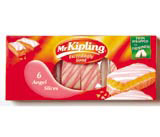
I agree with Steve Osborne that overall the packaging is beautiful and the whole concept is a vast improvement on its predecessor. One thing that caught my eye though, as I admired the new look, was the lazy typography on the back, telling me how this pack of Bramley Apple Pies comes from a range of cakes and pies. It probably looked good with dummy copy, but when that was substituted for the real thing it became a different story. It seems all the effort has been put into the front, and the back of the pack has been given to a junior to finish off.
We have placement graduates through our door each year and always try to teach them to avoid such things as forced justified body text. Lets not blow this out of proportion – it’s only a minor irritation, but it does send out the wrong message when a highly respected name such as Turner Duckworth sets type with gaps in it the size of Watford.
It’s a good piece of work chaps, but the detail lets it down.
Anthony Cromby
Creative solutions
Rolls-Royce
Derby DE24 8BJ
Read this next

-
Post a comment


