Austrian Airlines hopes to soar with Landor brand
Landor Associates’ London and Hamburg offices have rebranded Austrian Airlines Group, which comprises Austrian Airlines, Tyrolean Airways and Lauda, as the company moves to counter the global turmoil in the industry and refresh its image.
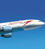
From this week, Tyrolean will be renamed Austrian Arrows, while Austrian Airlines will be known as Austrian. Each of the three carriers will share a new bird-like logo.
The revamped identity will be applied across the business class passenger lounge at Vienna airport, aircraft livery, print collateral including the in-flight magazine, signage, website and, later this year, a revamped cabin interior.
According to Landor Associates London executive creative director Peter Knapp, the strategic impetus for the rebrand was twofold with factors at industry- and company-level being decisive.
‘These have been impossible trading times for the airlines, but rather than retire into a defensive, shell-like position, [AAG] is making a strong statement about [its] ambitions for the future,’ he says.
The corporate motivation was about ‘bringing the brand components closer together’ and focusing on improving the passenger experience of travel to ensure that the airline remains ‘competitive, agile and relevant’, he says.
The identity work is borne aloft by the ‘Spirit of Spring’ theme, adds Knapp, which puts ‘colour and freshness’ back into the customer experience, evoking imagery ‘romantically associated with Austrianness’.
The work offers a ‘real separation from Austrian’s more mechanical competition, with vivid colours and a lightness of touch’, contributing to an ‘uplifting’ experience, claims Knapp.
‘For customers now, there is greater visual and experiential synergy,’ he says.
Landor was appointed a year ago, following a five-way pitch.

-
Post a comment


