Hitting the right note
English National Opera raises the curtain on its £40m refurbishment this weekend. It’s been a five-year project for Clare Ferraby, consultant designer at The Arts Team at RHWL, who was responsible for all interiors including colour palettes, seats,
September 1999
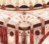
I return from a client meeting in Athens, where (Arts Team senior partner) Nick Thompson and I discussed the design for new Congress Hall and Opera House auditorium, to hear we are to be interviewed for the English National Opera project. After 20 years my initial concepts might at last come to life. I revisit the site and am again horrified at the 1960s degradation of Victorian/ Edwardian design. All detail in the auditorium is painted out in a drab stone colour, with dominant, hideous blue backgrounds. I must remove the 1960s inner proscenium lining and clumpish tympanum above: this building needs to soar. Where have all the drapes gone? Initial research shows potential of a splendid Greco/ Roman interior full of interest and vigour. Must find original (architect) Frank Matcham’s drawings.
November 1999
Following a successful interview, there is an urgent requirement for the auditorium concept to form the basis of the rest of the scheme. I study Matcham’s drawings, find quotations from contemporary journals on colours and determine from reference books the exact tones of Porphyry and Etruscan reds. I spend days in the auditorium between rehearsals drawing the volume, its details and brilliant junctions: Matcham was indeed a true master of space and decoration. I research parallels of Greco/ Roman decoration and produce the first colour drawings using creams/ golds and soft reds. I am fascinated by Matcham’s use of imperial purple. John Earl, conservation consultant, finds copies of original postcards showing proscenium drapes. Magnificent! I am going to have fun with the eagles.
February 2000
The board has accepted my broad approach – I must now develop the detail before building the whole picture. I select ladies at the first tier front as a prime example of my soft edge, painterly approach. I spend a day drawing and decide on gold lipstick to make them more glamorous. I produce the painting over three days, for agreement with the design team. I create a range of samples appropriate to each zone for presentation to heads of departments on a fortnightly basis.
December 2000
Nick Thompson and the architects have agreed with the client and English Heritage to use Matcham’s rhythms, colours and materials in a pared down, modern manner in new areas. This gives me great opportunities. I want to reassert the importance of the interior of the tower at every level through the use of red taken from the mosaics in the vestibule – this culminates in the tower room/ education space, which is a fabulous climax. Great that the cheapest seats have the finest views over London: that’s how we’ll attract new audiences, as well as providing a base for the education programme.
January 2001
I was encouraged by the board’s enthusiasm at the presentation. I can now develop the concept of my imperial purples and reds carpet scheme, to bind together these strong colours and provide a deep base for the development of the lighter hues on the walls. I develop a concept of two main carpets with varying scale inset borders as clydemas (rugs set into the main carpet). I work with Gabrielle Flood, project architect, and the other team members to develop a range of materials, including patinated bronze in conjunction with the manufacturers used for Bridgewater Hall and Athens. I develop a paint-by-numbers system with designer Jennie Edwardes based on my previous projects. This will allow painters to develop samples on-site with me as a basis for each area. First trials come back from manufacturers: a very exciting moment.
August 2003
Exhausting days climbing up and down the 26m scaffold to the dome in steeled-capped boots and a hard hat. Great to be working yet again with my favourite painters. I sample De Jongh’s magnificent plaster work almost daily: it probably hasn’t been repainted for 100 years. I am delighted by the quality of the detail – ideal surfaces for using my range of four or five gilts and silvers with soft wiped edges. As always, it is essential to remember the scale of painting when seen from the distance of the stalls far below (compared with standing so close to it on the scaffold). It’s an exciting day in the cupola when the glass workers restore the historic coloured glass. It’s a surreal world up here with a few skilled painters accompanied by eagles, angels and warriors.
February 2004
The scaffold has gone, we have worked down through the layers, drapes are now in and lighting is being balanced. It is an exhilarating moment to be able to stand and see all of this come together, lit again by the original lighting. I take a brief moment to sit alone and assess. Would Matcham approve? How will the client react? My training as a painter in Sheffield and Perugia has helped me understand the importance of composition, tonality and emphasis through stronger hues, together with the fall of light. This is one painting on a monumental scale.
Read this next

-
Post a comment


