Soapsuds
Sara Manuelli comes clean on the Design Museum exhibition Dirty Washing, which spans 170 years of international soap powder packaging
Purity and pollution are subjects that lend themselves to a myriad of highbrow interpretations. So it’s quite refreshing to see the matter of washing through the lens of soap powder packaging, and at the Design Museum rather than in an academic institution. According to the catalogue accompanying the Dirty Washing exhibition, this is a chance ‘to come clean and talk dirt about the language of purity… to see soap powder in a whole new light.’
Since Warhol’s celebrated Brillo boxes there has been a fascination towards the pop imagery of soap powder boxes. Most of them have been sold via comic strip-like names or slogans such as Duz, Fluff, Fab, Wisk and White King. They act as a reminder of an ideal world where everything is in order and squeaky clean, in a Superman-cartoony way. The graphic language of soap powder is particularly appealing for designers. Its swishes, hubs and circles, bold colours and italicised lettering represent the last century’s best example of lifestyle packaging.
Curators Lorraine Gamman, senior research fellow at Central St Martins College of Art and Design and Sean O’Mara, creative director of graphics at Rodney Fitch & Co, have a personal interest in the subject. O’Mara has even put his personal collection of packaging from all over the world on display as an example of vernacular graphics. But the two decided an exhibition would be livelier than a book, and have produced a selection that spans 170 years of package design and explores themes such as ‘Wasted and Washed up’, ‘Washes Whiter – Imperial Fantasies’ or ‘Mother knows best.’
To dish the dirt on the assumed cleanliness of soap powder inevitably brings up cultural issues. ‘Why is it that real men don’t do washing?’ asks Gamman. ‘The only male figure portrayed on soap packs is indeed Mr Clean, who with his earring and butch figure could easily pass as gay, yet Proctor & Gamble insist he is a sailor,’ she says. And understandably too, if it was to sell the product to a 1950s housewife. Another ‘dirty’ soap anecdote reveals that one of Proctor & Gamble’s 1970s Ivory Snow boxes featured aspiring actress Marilyn Chambers and a baby Brooke Shields as models for the mother and child. Six months later, Chambers became a porn star, tainting the image of snow-white candour with the eroticism of blue movies. The Chambers box was swiftly withdrawn from the market and is now a collectors item.
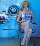
In addition to the worldwide collection of boxes, a series of young British designers have produced especially commissioned work. Katie Raath has transformed vintage boxes into handbags, while Nick Crosbie of Inflate has designed a special clothes peg.
Crosbie, with O’Mara and Terry Harrison, also designed the exhibition, while the PVC catalogue – again by Crosbie and O’Mara – includes specially written texts by Deborah Orr, Suzanne Moore and Will Self, among others.
Dirty Washing: The Hidden Language of Soap Powder Packaging is at the Design Museum, 28 Shad Thames, London SE1 until 2 September
-
Post a comment


