Handing out some advice
Mike Exon finds more charities are reassessing their brands to attract modern altruists and make a greater impression in the crowded fundraising sector
Charity isn’t a cool word. In fact, in these times of heady consumerism, when staying current seems like religion, the task that faces fundraisers has never been more poignant.
But design and branding is playing an increasingly large role in fighting outdated perceptions, particularly among a younger audience.
C-Eye is rebranding epilepsy charity The National centre for Young People with Epilepsy to sharpen its visual language (see News, page 5). And last week, The Salvation Army announced plans for its new-look international headquarters in London.
The latter has appointed Hat-Trick to help create some rather innovative-sounding public areas, including a café and an exhibition space (DW 25 September). It’s quite a departure for any charity, but particularly for this traditionalist one, associated more with military uniforms, flags and tambourine parades.
Involving the general public, on whom it relies for so much support, is key to the thinking, explains Hat-Trick founder Jim Sutherland.
‘The Salvation Army is aware that it needs to appeal to a younger generation of donors,’ says Sutherland. ‘But it’s all about balance. The trick is how to reach new people on the one hand while retaining traditional supporters on the other.’
Balance is the fundamental challenge echoed by all fundraising organisations, and is critical when it comes to reviewing a charity’s brand and image. How this is achieved is the $60m question.
There is a widely perpetuated myth that charities are somehow resistant to change, when, in fact most will jump at the chance to drum up new interest, believes Cancer Research marketing manager Robert Cummins.
The genesis of Cancer Research two years ago, following the amalgamation of two separate organisations, is cited by many as one of the recent branding success stories of the not-for-profit sector. Since the relaunch, undertaken with Enterprise IG, a big budget marketing campaign has dramatically increased the charity’s exposure and recent donation figures show a notable upswing.
‘Everyone was behind the change from the very beginning,’ says Cummins. ‘There were clear benefits to both the scientific and the fundraising elements of the charity, so we didn’t get the resistance you might find in rebranding a commercial organisation.’
If charities are resistant to anything it is spending lots of money on marketing, either because they don’t have it in the first place or because it is politically abhorrent. That said, attitudes within the charitable sector still seem split between those that believe in the need for as much brand investment as possible and those concerned their funds should be spent directly on good causes.
Elaine Ingram, marketing director of ARC, the arthritis research campaign, takes the view that for a smaller charity like hers, which doesn’t get Government handouts, not a penny can be wasted. Of the funds raised by ARC, she says 90 pence in the pound is put to work on fighting the condition.
‘We rebranded about a-year-and-a half ago, with the help of Sheffield ad agency Dig For Fire,’ says Ingram. ‘We were embarking on a new press advertising campaign with it to generate funding and raise awareness when Dig For Fire pointed out our identity was very stodgy. We were very fortunate in that it designed us a new logo at no extra cost,’ she says.
This is not unusual. A philanthropic approach to designing for charities goes with the territory. ‘There’s certainly a feel-good factor among people who work with charities,’ says Ingram. ‘Most suppliers do work for less money, but they’ll often still make a profit, even if it’s not as much as they might make from somebody else.’
Sutherland points out that taking a cut in fees seems to give some designers the idea they can have free rein artistically. ‘You do see some bits of work that look like they’ve been done to win an award rather than for the good of the charity,’ he says. And yet considerations about tone of voice, look and feel, and texture, all have a huge impact on a potential donor’s perception of your trustworthiness and reputation as an organisation.
It’s also absolutely critical to canvass the right people for opinions inside a charity, where passions will run high over the identity question, believes Wolff Olins designer Owen Hughes.
‘One of the key things we’ve found with branding a charity is involving all the relevant stakeholder groups in the project,’ says Hughes. ‘It’s all very well doing a flash new logo and colour scheme, but if you don’t actually win the support of the people in the front line – the volunteers – then the brand is going to fail.’
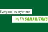
Hughes points to the Samaritans rebrand by Wolff Olins at the end of 2001. ‘It is an incredibly complex organisation, being a group of separately registered charities that operate under one umbrella. The way we had to get buy-in and approval was very complex, but we knew if it didn’t work the whole thing would be scuppered,’ he says.
The biggest rebranding projects and marketing programmes in the charity sector will always cause tongues to wag. There’s so much more at stake, and no guarantee that relative income levels will go up following a big marketing push. Measurability is essential whenever possible, which is why direct response TV advertising is often preferred to above-the-line work.
It’s sad to think that in the race for exposure charities have less hope of competing with corporations, on their relatively modest budgets. It might just take a more philanthropic approach from creative groups to keep them growing.
Read this next

-
Post a comment


