SiebertHead keeps things sweet for Cubs packaging
SiebertHead has designed the packaging for a range of fruit jellies from Fox’s Confectionery, named Fox’s Cubs, which represents the company’s first foray into children’s candies.
The range rolls out from 1 October, and marks the first launch for Fox’s Confectionery since undergoing a management buy-in earlier this month. Northern Foods sold the company to Big Bear Confectionery on 8 September.
SiebertHead’s challenge was to create packaging that would reflect the heritage of the Fox’s brand and stand out in an oversubscribed children’s confectionery market, senior brand manager Emma Gilbert says. ‘With so much competition we didn’t want anything too serious or boring,’ she says.
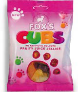
Head of graphic design at SiebertHead Paula MacFarlane says she ‘stretched the identity’ she created last year for Fox’s Glacier Mints and Fruits. The strapline – ‘clearly better sweets’ – which arcs over the bear logo and the company name, has been retained.
‘Fox’s Cubs is a quite a different brand [from Glacier Mints and Fruits], so in other ways we broke away from that mould,’ MacFarlane says. SiebertHead has applied strong blocks of colour to the packaging both to reflect the sweets’ flavours and to ‘appeal to parents and kids’.
The group has also introduced an ‘activity’: a series of paw prints running across the pack, one of which acts as a window to the product. ‘We could have used a large picture of [Pep, Fox’s Cubs’ bear cub logo], but we didn’t want to do that as characters can have a polarising effect,’ MacFarlane says.
The idea behind the paw prints was to ‘maximise on cute appeal’ and show that Fox’s Cubs are a ‘fun eat’, she adds.
SiebertHead was appointed in April on the basis of its packaging work for Fox’s Glacier Mints and Fruits (DW 10 October).
-
Post a comment


