
Modern Heraldry: why designers still use centuries-old branding techniques
Traditionally a practice reserved for soldiers on the battlefield, heraldry is still a go-to technique for many brands – a new book from Counter-Print explores why.
Thought to have been adopted sometime in the 12th century, the historic system of heraldry – coats of arms and other graphic armorial bearings – was designed so that individuals could identify themselves as belonging to a particular family, and showcase their heroic achievements. It was popularised on battlefields, so that those involved could identify their fellow soldiers.
In its simplest form then, heraldry was an exercise in visual communication, and new book from art and design publisher Counter-Print suggests it’s a tradition that hasn’t fallen out of practice. Indeed, earlier in the year, Design Week reported that the appreciation and adoption of heraldry and vexillology was a growing interest in modern regional Scotland.
As shown in Modern Heraldry: Volume 2, the design world continues to borrow from heraldry, with crests, stamps, seals, and shields a frequent fixture in modern branding.
“A byword for dignity and dependability”
There are multiple reasons why designers continue to turn to heraldry some 800 years on, Counter-Print co-founder Jon Dowling tells Design Week. But at its core, he says our modern fascination with the practice lies in its perceived “respectability”.
“The treatment is often seen as a byword for dignity and dependability,” he says, giving the examples of banks, train lines, schools, football clubs and societies.
And in the cultural push back against mass production and globalisation, Dowling says many brands featured in the book will have recognised the effect that a more traditional identity can have on the opinions of consumers.
“Audiences respond well to nostalgia,” he says. “Despite our modern obsession with technology, increasingly we are leaning towards craftsmanship and quality in what we choose to consume – designers will be keen to capture the visual romance and history of a brand or convey craftsmanship.”

“Each element can be subjective or literal”
Despite contemporary interpretations undoubtedly stretching the tradition, Dowling suggests there is scope to see where brands nowadays have drawn their inspiration from.
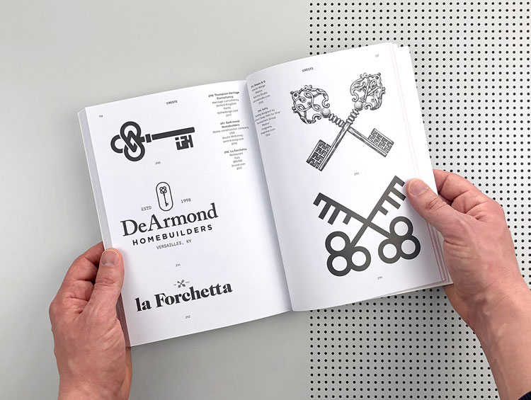
“There were many imaginative variations and combinations in every crest design that identified the particular carrier or owner of that crest,” he says. Examples include flowers with specific connotations surrounding hope and joy, or animal representing traits like wisdom, resourcefulness or loyalty. Modern heraldry is, he says, an extension of this.
“Each element can be subjective or literal – for example, sometimes the audience is asked to make visual leaps when elements are chosen to represent the geographical origins of a product or to read the marks literally when books are chosen for publishers, pens for copywriters and so on.”

“Counteracting” modern logos
Because today’s designers are equipped with such a wealth of technology and information, it is hard to discount this influence in contemporary heraldry, Dowling says.
“[Designers] are creating marks that intentionally counteract the highly-polished, digital-based logos associated with mass-consumerism,” he says. “Instead turning to craft-based mediums such as hand lettering, stamps, traditional symbolism and historic embellishment.”
The shield logo for the Football Crest Index project, for example, includes a stylised drawing of a football pitch to straightforwardly denote its mission, thereby combining traditional imagery with a sleek modern technique.
Elsewhere however, brands still lean into the ambiguity of heraldry. The Swedish ice hockey team Brynäs IF, for example, uses a more abstract laurel logo (pictured above, right) which features a trefoil (a three-leafed clover), which in heraldic terms can symbolise the past, present and future, or alternatively can be seen as a symbol of abundance.
“Intentionally designed as a nod to” heraldry
The first edition of Modern Heraldry was published in 2015. This second volume builds on the success of the first, with Dowling noting the team is a “well-oiled machine” now.
In all, he estimates the time spent collating the examples was just a couple of months: “To be honest, we are never not on the lookout for logos.”
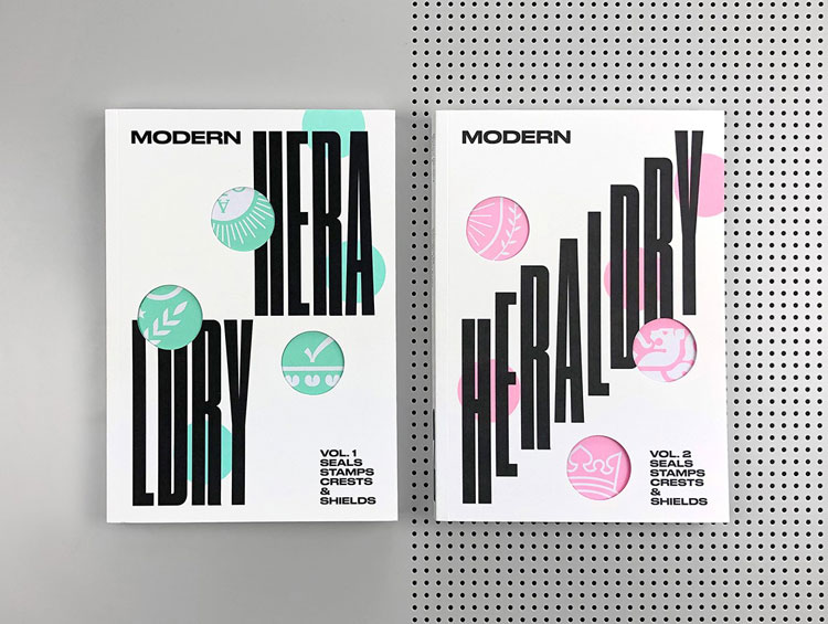
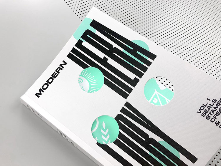
The Counter-Print team were also behind the design of the book itself. Modern Heraldry Volume 2, along with the newly redesigned Volume 1, features die-cut windows on the covers, which allow the reader to see crops of the logos beneath.
Wanting to reflect the subject matter at hand, Dowling says the team used typography to give a nod to heraldry.
“The type on Volume 1 divides the cover into four squares, while the typography on Volume 2 dissects the cover diagonally in half,” he says. “This was intentionally designed as a nod to the partition of heraldic crests and shields, while giving the covers a very modern twist through the use of the typeface and the colour palette.”
Modern Heraldry Volume 2 is available to buy on the Counter-Print website now.


amazing designs. the blog is awesome