Bees Knees look by Pearlfisher
Pearlfisher has created a name and revamped identity for Bees Knees, the product range from Field Honey Farms, one of the UK’s leading honey producers.
The work is part of the company’s attempts to broaden it’s retail reach and represents a significant change in style, according to Pearlfisher creative partner Karen Welman.
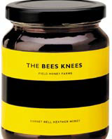
In the past products were known simply by the company’s name. Labels now feature a ‘subtle palette of colours’ designed to reflect the flowers the bees visit and the colouring of the bees themselves, Welman says.
‘The type of flower that the bee visits influences the honey’s flavour in a distinct way and the [labels now] display a contemporary image of these blooms. This, combined with the simple idea of depicting the bees’ body language, creates a visually impactful range,’ Welman explains.
The group was appointed in February on the strength of previous work. The product will retail at farmers m
arkets and specialist outlets from later this month.
-
Post a comment


