RSA brand refresh focuses on a “commitment to impact”
Design outfit Studio Texture has led the redesign, keeping the previous Pentagram-designed logo but introducing new colours, typography and tone of voice.
London-based design consultancy Studio Texture has refreshed the branding for the Royal Society for Arts, Manufactures and Commerce (RSA).
Established in a Covent Garden coffee shop in 1754, the RSA has been dedicated to “enriching social progress” through the study and innovation of arts, manufacturing and commerce since its inception.

Today, the organisation has more than 30,000 members around the world who share their research and findings on topics as wide-ranging as sustainable fashion, artificial intelligence, the future of work and society building.
With such a diverse range of topics covered in its output, the branding for the RSA was beginning to feel “confused”, according to Studio Texture founder and creative director Stuart Youngs. The team was invited to pitch for the project last year and work began in earnest at the start of 2020.

“Ramping up the impact”
The refreshed brand identity comes at a time when the organisation is switching its focus from “output to outcome”, Youngs explains. With plenty of ground-breaking research being done by its members, the time had come to start “ramping up the impact” of this work, he says.
The previous identity was the work of Pentagram back in 2011, and while in many areas the look still functioned well for the organisation, Youngs says other areas needed a change.
“Over the years the identity had been iterated and there were many different versions of the logo floating around with lots of different colours,” he says. “It’s that common thing that as time goes by more chances are taken with the branding and eventually the whole thing starts to fall down.”
A “hint of heritage”
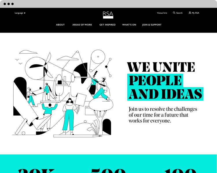
While the logo itself was “fabulous” and could stay as is, Youngs says the rest needed to be “stripped back”. Descriptors which previously appeared on the logo’s foundation stone have been got rid of, as have any colours outside of the brand palette of black, white and turquoise.
The foundation stone element itself has been retained, and because of its symbolic meaning of it and the RSA acting as a platform for ideas, has been adopted elsewhere in the branding.
“Rather than just be used as part of the marque, we wanted this element to work a little harder,” Youngs says. Sometimes it is used in graphics, other times to emphasise text.
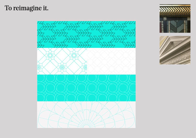
This is an attempt to “put some soul” into the identity, he says. Another example of this is the development of a series of patterns for use throughout communications which are based on the history architecture of the RSA building — to give the branding a “hint of heritage”.
“More editorial, less thinktank”
The typeface Gill, which is used for the logo, has also been brought forward into the new look. This has been paired with a bolder serif for “impact and contrast”, Youngs says, and both are used to underpin a new tone of voice.
“It is very much a copy and words-driven identity, so the typefaces needed to work perfectly together,” he says. “People are interested in reading interesting things, so we’ve had to make things look worth reading.”
The danger for organisations like the RSA, Youngs says, is that they begin to sound “too academic and almost thinktank-like” — the job here was to make things feel “more editorial”. Studio Texture decided on a “witty and intelligent” but sometimes provocative tone of voice. This is reflective of the organisation, according to strategy director Louise Kyme.
“The whole point of joining the RSA is that it is an organisation that will support but provoke you,” she says. “That was the focus for the tone of voice too.”
The new look will now be rolled out across the organisation, including a new simplified website.

-
Post a comment


