Distinguishing character
At last, a new font for people with dyslexia is being created by designer Natascha Frensch. All that needs to happen now is for it to be used in children’s education. Sara Manuelli reports
Natascha Frensch has certainly tapped into the zeitgeist. Her font for readers with dyslexia has not only aroused the interest of designers, dyslexics and sponsors alike, but will no doubt also feed the current wider debate about how to cater for learning difficulties.
The Dutch-born, Royal College of Art graduate is herself dyslexic. However, she wasn’t diagnosed until later in life, and spent most of her education years grappling with reading and spelling. Several teachers questioned whether she was ‘word blind’ (the Dutch definition for dyslexia), but at the time, problems with language were often dismissed.
Today tables have turned, and attention to children’s learning difficulties has increased. According to a recent article in The Times, the number of children registered with special needs has doubled over the past decade to 1.4 million – an increase from 11.6 per cent to 19.2 per cent in primary schools and from 9.6 per cent to 16.5 per cent in secondary schools. The term encompasses learning difficulties such as dyslexia, to various syndromes on the autism spectrum.
The way education is structured is the key to allowing dyslexics to learn. As Frensch explains, it’s not just reading that creates the problem, but also hearing. ‘Many dyslexics understand words in a phonetically different way, so it might seem that they haven’t heard the question properly. A lot of the problems arise from how you are educated. Dyslexia is just another way of processing information, so it asks for another way of giving information.’
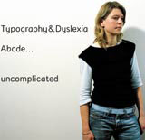
Her interest in creating a font for dyslexia started while she was studying for an MA in communication, art and design at the RCA. At her degree show Jeremy Myerson, director of the Helen Hamlyn Research Centre, offered her a place to continue her typographic project. Funding from the Audi Foundation then allowed the work to develop. The font, called Read Regular, is a sans serif typeface designed to be ‘uncomplicated, deliberately dressed down, taking away all the unnecessary details’, she says.
In fact, Frensch believes that for dyslexics, serif characters are more difficult to read. The ‘flicks’ of the characters, the lines and curves as well as the close spaces in between individual letters, all create confusion. Over three years, Frensch has tested her font on about a hundred people, both children and adults, as well as elderly people. One of her test consists of comparing a Harry Potter extract in various fonts, including her own, which is deemed to be far more readable.
Her Helen Hamlyn research project will be presented in October. The results are to be published in a book printed in The Netherlands on special tinted off-white paper with blue ink, with some pages featuring conventional white paper and black ink to provide contrast. Frensch is also planning to provide the font for a Swedish children’s book written to explain dyslexia. She is adamant that the font should not be sold by a type foundry but instead used in schools. ‘Otherwise it goes into the world of graphic designers,’ she says. Other uses could be for back-of-pack copy found on the pharmaceutical packaging for elderly customers.
Dyslexia and theories about how to facilitate reading through typography have interested designers before. In Frensch’s book there is a quote by Gerrit Noordzij, a Dutch type designer who believes that writing a word and shading the counter shapes of the letters is the best way to understand what a word is. He believes that eventually dyslexics will develop the capacity to read as a ‘training of perception’. Frensch argues that this does not necessarily work for her, and that dyslexics tend not behave automatically.
But as Frensch says, ‘Just like there is no one way of dyslexic thinking, there isn’t just one study or typeface. I want to inspire others. It’s a first step. Some might not like it, but it gives confidence to change the situation.’
-
Post a comment


