Ashleycarter energises Spiked can
AshleyCarter has redesigned the packaging for energy drink Spiked Silver, which launches across Europe and beyond from 25 March.
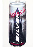
The consultancy has also redesigned graphics for the can, although the logo remains the same.
The work has resulted in a fee of £100 000 for the group, which includes design and development.
The can, which will be relaunched in the UK, Germany, Denmark, Sweden, Israel and South Africa, has moved to a ‘shaped’ format. The shape, which is a waisted cylinder, was inspired by sister brand Silver Arrow’s bottle, which the consultancy designed in 1999.
The original red colouring in the word Spiked has been replaced with a cranberry colour to reflect the flavour of the drink and the ultraviolet feature on the word silver has been removed.
‘We think the shaped can will be a key distinctive factor in the energy drinks sector. I think this is a radical move for the sector,’ says AshleyCarter director Edward Ashley-Carter.
‘The original is the typical 250ml can – the Red Bull shape. We are moving it on because we have got a young client base.’
The consultancy did not pitch for the work.
It has been working as brand guardian for Silver Arrow Establishment since 1999 and designed the original Spiked Silver can in 2000.
The £609m UK energy drinks market is dominated by Red Bull (Source: Datamonitor).
-
Post a comment


