Visual volumes
Adrian Shaughnessy looks at the editorial design of photography books, but believes the images speak louder than the layouts
In his 1931 essay, A Short History of Photography, the Marxist critic Walter Benjamin quoted Laszlo Moholy-Nagy: ‘The illiteracy of the future will be ignorance not of reading or writing, but of photography.’ Well, any cultural studies graduate will tell you that Moholoy-Nagy’s prediction has long since come to pass.
Advertisers and designers toy endlessly and confidently with our ability to decipher, decode and deconstruct images. It seems that today everybody is a cultural studies graduate.
But just as everyone can now ‘read’ the images that surround us, everyone can now call themselves a photographer. We’re free from any constraints or outmoded notions of what a ‘photograph should be’. You just point and click.
Certainly, if I look at the young eager-eyed graphic designers who show me their portfolios, many of them have enough photographs of abandoned supermarket trolleys, disused packaging and empty municipal car parks to start a photolibrary. Everything is an image, no matter how banal or inconsequential. Everything is a subject fit for photography.
But what some of these chroniclers of the zeitgeist may not fully appreciate is the enormous debt they owe to the great American photographer William Eggleston. Born in Memphis in 1937, Eggleston is a great American artist. He is not an observational photographer. He does not record. Instead, he ‘makes pictures’. He is a visionary colourist. He is the e e Vermeer of Memphis, a master of contemporary photography.
Before Eggleston came to public notice in the mid-1970s, art photography was almost exclusively black and white. Colour photography was reserved for purely commercial uses, or the formal expressions of the photographer’s art, such as portraiture. ‘By intensifying the banality of the colour snapshot to a level that demanded aesthetic response’ Eggleston changed all that.
Eggleston’s use of colour within pictures of anonymous interiors, and emotionally neutral scenes of urban American life, caused widespread dismay. Viewers weren’t ready for the remorselessness of his gaze or ready to confront the purity of his vision. This was a man who could find aesthetic worth in a naked light bulb, three white wires and a red ceiling.
But Eggleston’s ‘snapshot aesthetic’ suits our jaded contemporary appetites. He is a supremely modern figure. Now in his 60s, there is a heroic stillness at the heart of Eggleston’s work that gives it a visionary glow. You can see it on nearly every page of a new book devoted to his work, William Eggleston by Hervé Chandès (published by Thames & Hudson in February, priced £29.95).
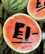
Eggleston’s genius is confirmed by a flick through Takeaway (published by Booth-Clibborn Editions at the end of March, priced £19.95). This is a lively book, unpretentious, worthy and witty. The books creators, Ingrid Rasmussen and Anthony Webb, have set out to record a hidden Britain of ethnic fast food joints and fruit and vegetable stalls. The sort of corner shops and stalls that sell, ‘arrays of Caribbean plantains, Nigerian batiks, Indian saris, Afro-American hair extensions, dried fish, Halal lamb and Iranian caviar.’
You can see why Rasmussen and Webb might be attracted to this world. It’s a vibrant and welcome alternative to the other Britain – Supermarket Britain, with its standardised-health-and-safety-designery-vac-packed products, all in the same packaging, all at the same price (and don’t forget the money-off coupon).
According to Rasmussen and Webb, ‘The images here form our perspective on inner city Britain’, but flicking through Takeaway, you don’t get the sense of a new perspective. After you’ve looked at all the hand-scrawled price lists, the vegetable, the fruit, the pigs’ heads, the compelling swirl of colour and ethnic vitality, you’re left with the sense that this exercise is perhaps better suited to an article in a Saturday broadsheet supplement than a book.
As a book it fails. The design is suffocating, everything is full bleed, all the images butt-up to each other, the colours are saturated. The end result is a sort of uniformity, a sort of enforced homogeneity, something I’d guess the authors are opposed to.
A similar problem hangs over photographer Gerd Kittel’s The Final Cut Route 66 (published by Thames & Hudson on 18 February, priced £19.95). Route 66 is one of the world’s great highways. It isn’t even called Route 66 anymore, it was de-commissioned in 1985, but it’s still there, under a variety of names, stretching from Chicago to Los Angeles.
It’s a familiar, well-documented stretch of mythic America. Much of it has a sort of Thelma and Louise, Natural Born Killers epic quality to it. And herein lies the problem: all those lonely gas stations and infinitely receding highways have become dangerously close to cliché.
As a photographer, Kittel is devastatingly proficient. But occasionally he lapses into travel brochure lushness. The skies are supernaturally blue and the whites are shimmering white. After a while you long for a more tangential view. In truth, you long for Eggleston.
The book’s design is much like the photography: efficient and technically competent, but a tad predictable. The book designer has one eye on the WH Smith market and as a result has missed the opportunity to inject an element of Route-66-On-the-Road-Kerouac-like anarchy.
If you like your meat blood red and raw, check out A Maverick Eye – The Street Photography of John Deakin by Robin Muir (published by Thames & Hudson on 8 April, priced £36). Deakin was an acerbic-eyed chronicler of Soho, long before the Groucho Club became a place for former stand-up comedians to discuss their latest sitcom or West End musical. Soho in the 1950s was a refuge for genuine artistic talent. It was the centre of bohemian London. It was home to Francis Bacon and a troupe of lesser artists, poets and scene makers. Deakin was their house photographer.
He photographed the Soho denizens with a raw candour. A painter before he became a photographer, Deakin had an eye for formal composition. You can see it in his portrait of Bacon, the high priest of Bohemia: Bacon’s collapsing features and owlish gaze, closely resembling one of his own portraits. Also in his picture of three Soho-ites (Bruce and Jeffrey Barnard with Terry Jones) outside the Lucky 7 Club. They look like a boy band with A-levels.
During the Second World War, Deakin worked as a photographer in the Army Film Unit. By 1947 he was a staff photographer at Vogue, alongside Cecil Beaton and Norman Parkinson. But Deakin was a reluctant fashionista. His dour eye and his dissolute lifestyle meant that he got the sack from the high alter of British fashion. (He was subsequently re-hired and sacked a second time).
As well as his searing portraits, Deakin was a chronicler of street art and commercial signage. His painter’s eye meant that he often found graffiti of staggering beauty. In Paris and Rome he photographed beautiful chalk wall drawings that look as if Jean Michael Basquiat might have drawn them.
Deakin died in 1972 of heart failure while recovering from an operation for lung cancer. There is a melancholy aspect to Deakin’s life (superbly told by Muir). It’s there in his photographs: an inherent sadness; a fragile humanity. Deakin is easily dismissed as a footnote in accounts of 1950s Bohemian London, but he was more than that. He was as good as, if not better than, many of the more famous figures of British photography. As a ‘street photographer’, he might be the best we ever had. m
Adrian Shaughnessy is creative director at Intro
-
Post a comment


