Your move
Board games are growing in popularity, but coming up with something stimulating and original is a challenge for any graphic designer, says Yolanda Zappaterra
Calling all graphic designers – are you fed up with designing annual reports and soap powder packaging? Are you looking for something a little more fun? Perhaps you should consider game design – not the computer ones, but good old-fashioned board games.
There’s never been a better time to move into this sector. Historically, in times of economic turbulence, games do well (Monopoly and Trivial Pursuit were launched during the 1930s Depression and the recession of the 1970s respectively). Today, the figures say it all. In the first half of last year, sales of board games and puzzles for adults rose by 84 per cent, despite a 1 per cent drop in toy industry sales, and hearteningly, many of these games were produced by independent companies rather than the toy manufacturing giants.
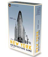
German book and game publisher Prestel is just one company hoping to cash in on this current popularity. Its New York Architecture Game, launched in the UK this month, is a well-designed, elegant game of skill and strategy. The aim is to construct 24 of the city’s most iconic buildings and landmarks. It’s an intellectually stimulating game that demands not just memory skills but the ability to recognise quickly individual parts of famous buildings – not easy when you have to distinguish them from surrounding structures.
Its creator, Thomas Fackler, describes it as ‘a game for older children and adults’, and says its main aim is to ‘entertain’. But it’s also meant to be a challenge without resorting to the typical question and answer format. ‘Its design [by Ilja Sallacz and Sebastian Onufszak of Augsburg studio Liquid] enables players to commit all of a building to memory, thus learning at the same time as having fun,’ he says.
The game’s materials complement its subject: chunky wooden marker blocks, high-quality matt linen cards, a reduced colour palette, black and white shots of the landmarks and an accessible accompanying book. The game ‘combines fun and art’, says Sallacz, who believes game design is integral to playability. ‘When people buy a game they notice it first because of its visual appearance. Then they look at the subject matter. So, first we have to create a design that stands out from the crowd,’ he stresses.
One of the more unusual elements of the New York Architecture Game is its use of photography throughout. ‘It wasn’t easy to direct attention towards the architecture of individual buildings, but by using colour gradients and monochrome backgrounds, we highlighted them without eliminating the surroundings,’ he says. ‘It was vital for us to portray historical New York with a touch of modernity in order to show the development of architecture in the city.’ The reduced colour palette – grey, yellow and blue – adds to the adult feel of the game. Finally, Sallacz and Onufszak created a bespoke typeface, Jaursch, to emphasise the game’s contemporary feel.
The New York Architecture Game may be beautiful, but it’s arguably less accessible than other, more popular, games. Winner of this year’s European board game prize, Spiel des Jahres, is Ticket to Ride, manufactured by California-based Days of Wonder. Designed in-house by Julien Delval, and conceived by Alan R Moon, the game centres around a cross-country train journey in North America. It’s unlikely to be universal in its appeal, but architects should love it, and it may well persuade a few graphic designers to develop their own game – or at least have a go at updating Scrabble’s typography.
What’s your favourite game and why?
‘Draughts. The simplest. It’s just squares and circles.’ Andy Altmann, partner, Why Not Associates
‘For its complexity, symbolic richness and elegance, chess. The black and white board can’t be beaten for its simplicity.’ Karin Fong, partner, entertainment design consultancy Imaginary Forces
‘Snakes and ladders. Because it’s simple (intended for pre-schoolers), with just enough booby traps to make it interesting.’ Steven Heller, design writer, academic and lecturer
‘I like them simple: dice, dominoes or the consistency of a chessboard: squares in a square, and the endless organisation of beautiful strategies. The diagonals of the backgammon board have a certain appeal: intaglio spikes covered by shiny circles.’ Michele Jannuzzi, director, cross-media design specialist, Jannuzzi Smith

-
Post a comment


