Formula E rebrands to become more “relevant”
The new identity has been designed by Prophet, while the electric motorsport series has been brought to life on-screen by DixonBaxi.

Electric car racing championship Formula E has unveiled a new visual identity, as it looks to appeal to a younger audience.
The first season of the electric street racing series launched in 2014 and it has taken place in cities all over the world, including New York, Hong Kong, Paris and Rome. Brand consultancy Prophet has rebranded the championship to coincide with its fourth edition this year.
The new identity aims to differentiate it from more established racing series Formula 1, and give it a more “relevant” look that will attract a millennial audience, says Prophet.
“The answer was to stop trying to compete with Formula 1 and move the goal posts completely,” says Prophet partner Greg Handrick. “By conducting extensive primary research, and specifically talking to fans, we honed-in on the single big idea that will make Formula E distinct and famous: electric street racing.”
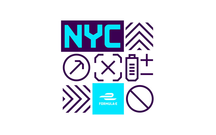
While the lack of noise and lower speeds than those traditionally associated with motorsports could be perceived as a “shortcoming”, adds Handrick, Prophet looked to turn these factors into a “differentiator”. The identity features layered and juxtaposed elements that mirror an urban cityscape, as a nod to the fact that the races are able to take place in cities.

The logo retains the existing, interlocking “e” symbol, but pairs it with the name Formula E set in a new typeface. Inspired by a typeface found on a travel poster from the 1920s, Prophet worked with studio Yarza Twins, typographer Rob Clarke and Formula E’s in-house design team to draw an updated version of it.
The consultancy has also “electrified” the racing series’ original blue to make it “stand out on the track”, says Prophet creative director Gregg Finlay, and added a rich, dark purple as a second colour. “This is in opposition to the traditional, masculine reds and blacks seen in motorsports,” adds Finlay. A series of new icons such as crosses, arrows and chevrons are inspired by signs and road markings often seen in cities.
Meanwhile, DixonBaxi has reimagined the racing series’ title sequences, in-match graphics and idents based on the new identity. New on-screen design elements include reactive battery level monitors, representative race positions, timing indicators and driver identifications.
The new identity has rolled out across all touchpoints.


somebody’s been drawing from The Designers Republic..!
Really interesting and personable, loving the geometric font and vibrancy.
Calvin
99designs
Reminds me of the beautiful work The Designers Republic did on the Wipeout Playstation games in the late 90s