That shrinking feeling
As broadsheet newspapers get to grips with the tabloid format, Clare Goff finds out how they preserve their character without sacrificing quality and clarity
In the tabloid’s weaning period The Independent was keen to assure readers that they were getting the same amount of content.
Parallel publishing meant that the broadsheet format was still dominant; as the newspapers make a more permanent shift to tabloid, the necessary shifts in design are being implemented. ‘Pace is very important in a tabloid format,’ says Porter. ‘If you have more than 40 pages of news there is a danger of monotony.’
Both The Independent and The Times have begun to break up pages of news stories, which appear denser in tabloid format, with diary or feature pieces.
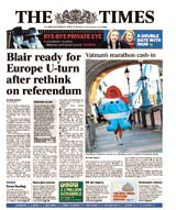
The Independent has embraced tabloid format more readily, running the high impact front pages with a single image or piece of text, but so far the transition of broadsheet to tabloid has been a case of pouring-to-fit rather than a design revolution.
Early tabloid examples have been accused of not shaking off the broadsheet sensibility.
‘Their basic toolbox is not right,’ says Porter. ‘Producing a tabloid is a whole new discipline.’
Bayliss says The Independent has a long way to go design-wise, and is keen to start from scratch.
Porter believes that ‘design cannot be separated from journalism’ and that there should be a rethink of the new tabloid’s journalistic approach in the new format.
Norbert Kupper, organiser of the annual European Newspaper Design Competition, says clear reader guidance is essential in a tabloid format. He proposes the introduction of a front-page section guiding the reader through the title, and suggests that each inside section could be a different colour. For titles with large inside sections, he suggests the creation of pull-outs. Business, for example, could be a salmon pink pull-out.
Advertising is a big problem in a tabloid format; advertisers get more impact in a smaller format, but are unwilling to adapt their sizes to fit. ‘Every page is choked by ads,’ says Bayliss, a problem our European counterparts have not encountered (their editorial/ advertising ratio being smaller), or have chosen to ignore.
David Hillman, a partner at Pentagram, redesigned the Guardian back in the 1980s. He says that the success of the Daily Mail, which was originally a broadsheet, meant tabloid design had not moved on. ‘Forget multiple stories on a page and put a single story on a page, or run a story over pages. Use pictures bigger,’ he suggests.
Maintaining brand identity is key, and something The Daily Telegraph is struggling with. Its dummy tabloid has been described as well-designed, but the smaller format will only appear if its new owner feels readers are ready to shake off the broadsheet format.
Hillman received hate mail after introducing a tabloid section to The Guardian in the 1980s, but the stigma of tabloid is fading into the annals of newspaper history.
The current challenge for newspaper designers is to match function with form, remembering that the newspaper’s role, as well as its format, is in flux.
‘The concept of a newspaper being a daily publication of news is becoming obsolete in a multimedia world,’ says Hillman.
‘There’s no such thing as a breaking story when broadcast media can report it faster. A newspaper’s role should be to fill in the detail and provide comment on what is going on in the world.’
Read this next

-
Post a comment


