Sweeten the brand
Head of design Stuart Gordon tells Hannah Booth how packaging and store interiors need to work together to sell Thorntons’ confectionery and dessert ranges
If Britain enjoys another summer like this year’s record breaker, Thorntons could be crying into its melted vanilla truffles.
Profits tumbled nearly 10 per cent in the six months to June, and like-for-like sales fell almost 2 per cent in July and August. On a real scorcher, said chief executive Peter Burdon at the time, sales could be 15 per cent down on the previous week.
But the movement has led to a bid approach, which Thorntons turned down last week to try to flush out a higher offer. As a result, shares have soared.
None of this is unduly concerning head of design Stuart Gordon, an amiable, talkative and slightly leftfield Scot who joined in January from Nottingham-based consultancy Pure by Design.
‘It’s one of these things. Whenever there is significant movement [in the share price], you have to comment. It shows we’re a company going places,’ he says, with the air of a well-briefed communications director. Does it mean Thorntons will shift its focus to less meltable products? ‘We already manufacture cakes, toffee, biscuits and ice-cream, but there’s only a finite amount of space in our stores,’ he explains.
Gordon has a lot going on. First, he’s trying to work out what to do with Thorntons’ stores. He appointed Checkland Kindleysides last week after a five-way, initial pitch held last month (DW 25 September). And second, he’s overseeing a major change in the way Thorntons buys design.
His current train of thought regarding Thorntons’ 600-odd UK outlets is that the product should do the talking. ‘If fixtures and fittings are too obvious, they detract from the packaging,’ Gordon explains. ‘Sainsbury’s seems to have adopted this approach, with neutral, battleship-grey shelving that lets products and lifestyle shots come forward.’ He’s even clearer on the role of stores, particularly for a chocolatier. ‘Chocolate is an emotional, irrational purchase. We don’t want to sterilise the chocolate-buying experience with strategically thought-out interiors. There’s an element of intangibility involved that you can’t measure,’ he says.
To achieve the ‘X-factor’ in-store, Gordon is keen to stimulate ‘curiosity’ among consumers. ‘The key word here is eccentricity,’ he explains.
‘Thorntons is known for its Englishness and heritage, both good, solid values, but eccentricity is something [the English] should also be proud of. We need to inject some of that into our stores, alongside theatre and even a degree of madness.’
‘People take a journey through retail environments. We must address the way our stores “greet” customers, and make them more evocative and memorable. The way people shop in Thorntons should be the same experience as opening a box of chocolates,’ he says.
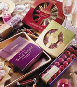
The store environment is one thing, but packaging is clearly just as important to Gordon. It affects the look of the store’s interiors and it serves to represent the brand once the consumer takes it home with them.
He commissioned Brewer Riddiford and Ziggurat to revamp packaging for Thorntons’ two flagship products: its Continental Chocolate and Toffee ranges (DW 17 July). At customers’ requests, the toffee packaging nods more strongly towards Thorntons’ strong manufacturing heritage.
It’s seen as a family company, despite floating on the stock market in 1988. In 1911, commercial traveller Joseph William Thornton opened a sweet shop in Sheffield. By 1939, it had 35 shops. Chairman John Thornton now owns 5.5 per cent of the company.
‘Almost 80 per cent of the visual appeal of a store comes from the packaging of the products. The rest – shelving, flooring, walls – is less important,’ he says. The recent revamps have had one detrimental effect, however. ‘The trouble with big relaunches is, it makes the other stuff look more shoddy,’ he adds.
Brewer Riddiford and Ziggurat are working for Thorntons on an ‘on-off trial’ basis, he says, and he’s in discussions with ‘a few other people’. He’s keen to work with a broad spread of consultancies, as he believes groups usually have one particular strength.
‘Most consultancies do one thing better than another. I want to work on blue-sky projects with some, and use more “workhorse” groups on other briefs,’ Gordon says.
He says Thorntons should play up its strengths as a sourcer of ingredients, underlined with its ‘Art of the Chocolatier’ strapline. ‘We’ve not shouted about that [in the past].’
Having worked on the consultancy side, he believes the most obvious difference with working client-side is that, in-house, design is a ‘support service’, not the core raison d’être of the company.
‘Thorntons makes chocolate, it’s not a design group. Working client-side is more about the profile that a particular company gives to design, and how much importance shareholders place on it,’ he says. With Gordon at the helm, design shouldn’t find it too difficult to fight its corner.
Stuart Gordon’s CV
1995 Sets up Gordon Design
1998 Senior designer, Boots the Chemists
2001 Sets up Pure by Design
2003 Joins Thorntons as head of design
-
Post a comment


