Time Out at 50: the top six covers from the past 50 years
City life editor at Time Out, James Manning, tells Design Week the stories behind some of the most interesting covers from the past 50 years.

Time Out is marking its 50th anniversary this year and celebrating with an exhibition and new book dedicated to its top 50 covers over the years.
City life editor at Time Out, James Manning , curated the show at the Museum of Brands alongside global creative director Tom Hislop and global editor-in-chief Caroline McGinn. He tells Design Week what his top picks are.
Choosing one cover from each decade, he explains what makes each one important, the story behind it and the key design features.
Time Out London: Issue 1 (1968)

“This is issue one, which gained iconic status within the company and to an extent outside it. It is a symbol of where Time Out came from and it attained this status despite being really weird.
No-one I know has looked at it and said: “Oh yeah, I know what that is.”
To me it looks a bit like an acrobat in fishnet stockings or something, but actually it is a piece of computer art form the Institute of Contemporary Art (ICA) from an exhibition called Cybernetic Serendipity.
Time Out had strong links to the underground press but also covered the best of the mainstream, which is why this cover works so well – it doesn’t pigeonhole the magazine as a groovy music or fashion mag of the era, but something much more timeless.
It was chosen by our founder Tony Elliott. Tony cut out the shape from a publicity photo for the exhibition and put it on the black background.
He had to literally go around town with a sack of these things selling them so the design was important.
It started as a publication that folded down to A5 and was printed entirely black and white in the first few years.”
Time Out London: Winston Churchill (1974). Cover by Pearce Marchbank, photographed by Roger Perry

“This is a Pearce Marchbank classic. He joined as art director and introduced Franklin Gothic which we still use today and the original Time Out logo you see here.
Quite quickly, he left the staff but still designed most of the best covers for the next 13 years or so, working from his studio. He had about two days from talking with editors to solidifying the artwork.
What I like about this cover is it is literally two fingers to the mainstream. It was 100th anniversary of Churchill’s birth so most of the press were going into overdrive to celebrate this great icon of Britain. Time Out did not do that.
From the 1970s onwards, Time Out started to become quite radical politically. It would take on mainstream opinion, campaigned for LGBT rights, squatters’ rights and ethnic minorities’ rights. When everyone else was doing one thing we would do the opposite. That goes for the design as well.
A lot of the memorial magazines had a picture of Churchill’s face on it. Pierce said to me he wanted all the other magazine covers to be like a background for this one, he wanted people to see the cover from over the street.
Working with photographer Roger Perry, they enlisted the cleaner of their studio to be Churchill’s hands. It is one colour with black and white. You do something like this it is going to stand out.
This cover was shortlisted for the PPA (Professional Publishers Association) best magazine covers for the past 100 years.”
Time Out London: The new video games (1980). Cover by Pearce Marchbank

“Space Invaders launched in Japan in 1978 and soon after in the UK. It was still a relatively new phenomenon and became a huge craze.
There wasn’t a lot of coverage on computer games – the first dedicated UK magazine looking at computer games didn’t launch until 1981 – and I think the fact that Time Out did a cover on it is quite astounding.
Pearce Marchbank and his assistant did it manually, which I think is insane – it was done by printing lots of little prints that replicated the look and feel of digital graphics.
It was cut-out bits of paper stuck on to a wooden board the size of a bed, photographed and turned into a cover. He was one of the first people to have a process camera.
Pearce said this kind of thing would take you two seconds in Photoshop now but back then it was an incredibly difficult process.
Back then when he only had two days, I think it is amazing the level of detail with the little lines and pixels, it looks exactly like the original Space Invaders using cut-out bits of paper.
This is way ahead of its time created two years before anyone used the words ‘pixel art’.”
Time Out London: The highs and lows of drugs (1994). Cover by Jeremy Leslie, photography by Richard Dean
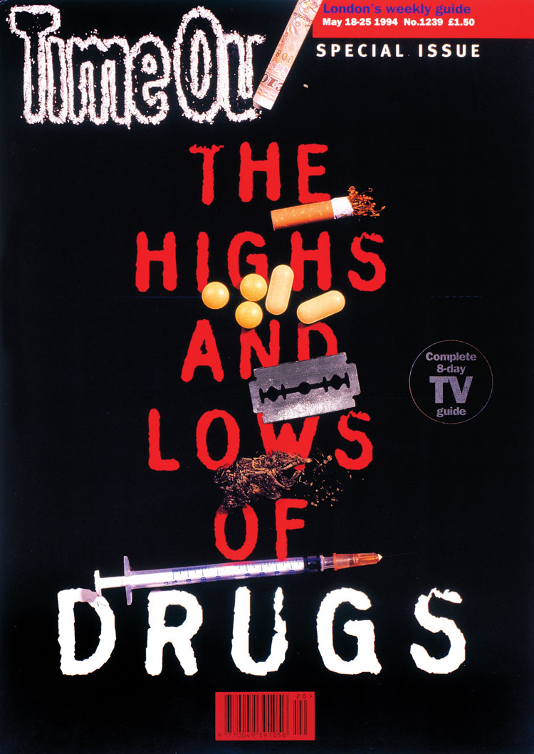
“This is another one where they have messed with the time out logo – you always have to ask for permission from Tony to do that.
This is a kind of a response to Nancy Reagan’s Just Say No campaign, which was an nuanced, unambiguous say no to drugs thing.
It was to say people do drugs and they won’t stop just because you tell them not to, so we are going to devote an entire issue looking at both the ups and the downs.
It is a realist, non-sanctimonious look at exactly what is says on the cover: ‘The highs and lows of drugs’.
What I like about it is how playful and ballsy it is. It makes drugs look kind of glamorous but also terrifying at the same time.
I love what they have done with the logo, it is ridiculous. Jeremy Leslie, who was art director at the time, said it was the only time he was ever allowed to “claim drugs on expenses”.
The white, black and red is a classic colour combo. It is also a kind of typewriter font which looks like a government report, you look at this and it looks like something that is setting out the facts.”
Time Out London: Is London’s Future Islamic? (2007). Cover by Nick Booth

“I find this one very interesting, it is an incredibly contentious topic. It is a brave thing to do, to have a cover line in Arabic less than two years after a major Islamic terrorist bombing in London.
One of the things which came out of those bombings is the Islamophobia, fear and suspicion of the Islamic community in London and UK.
This cover was intended to shine a light on the positive aspects of Islamic culture and the contribution that Islamic people have made on the capital.
It is taking a stand on an unpopular viewpoint knowing you are going to divide people and views with that.
Having just a plain cover with some text on it is something Time Out has done quite frequently. It says ‘Is London’s Future Islamic?’ in green, which is a very important colour in Islam. You read Arabic from right to left so the question mark was on the other side.
But it was one of the worst selling issues. Aside from being a controversial topic, Gordon Thomson, the editor at the time, said that there was an unwritten rule: green covers don’t sell.
It was a failure commercially in terms of how it performed but it was one of the most talked about things in London that week.”
Time Out London: Green London (2017). Cover by Tom Havell, text by Chris Waywell and Gail Tolley

“Time Out London went free in 2012, so that changed what we could do with the cover, it didn’t have to sell the magazine anymore.
In the 1990s and noughties there was a lot more cover lines about what was inside the magazine. Now it is free, we didn’t have to do that, it took the burden off and meant we can do stuff that is a bit more playful.
This cover is like a colour swatch of different greens which relate to London. The reason we did this is 47% of this city is green space and it was a big push with the National Park City campaign to make more of London green.
This cover is an ode to all the different London greens, from The Churchill Arms pub in Notting Hill, to Bethnal Green, the cab shelters, mushy peas, theatre curtains… Chris Waywell, the associate editor and Gail Tolley, the London editor, went around the team asking the office for green things in London.
It is not just trying to get your attention on a news stand but is something you can spend some time with and read like a feature as well as appreciating it is a piece of design.
Each bit is a different green and has the CYMK value so you can create it at home.”
All images courtesy of Time Out.
Time Out 50: 50 years, 50 covers exhibition is on display at the Museum of Brands until 3 March 2019. For more information, head here. The accompanying book is on sale here for £23.50.


To quote Jacob Rees-Mogg (and I wouldn’t under normal circumstances) this show is extremely “thin gruel”. Considering the output of ‘Time Out’ over the last 50 years, just featuring 50 covers is a bit pathetic. 50% of the selected covers are not very good. The remaining 50% are all designed and art directed by Pearce Marchbank and are brilliant. http://mikedempsey.typepad.com/graphic_journey_blog/2018/10/time-out-50-below-par.html