
Wood engravings inform Coronation stamp design
Atelier Works commissioned artist Andrew Davidson to work on the stamp illustrations, which were based on wood engraving similar to those he produced for King Charles III’s book, Harmony.
Graphic design studio Atelier Works has designed the four Royal Mail stamps issued to mark the Coronation of King Charles III and Queen Camilla, using illustrations which show thematic wood-carved scenes.
The rostered studio was selected by Royal Mail, and worked to “a compressed timescale”, according to Atelier Works partner Ian Chilvers. After reading King Charles III’s book Harmony to find out more about his interests and work, Chilvers says he became aware of British artist Andrew Davidson who created a wood engraving for the book jacket and so commissioned him to work on the stamp project.

Chilvers explains how Davidson’s composition for the stamps “proves that a traditional craft approach can represent contemporary issues”. Each of the stamps depicts a different theme based on one of the monarch’s interests or commitments.
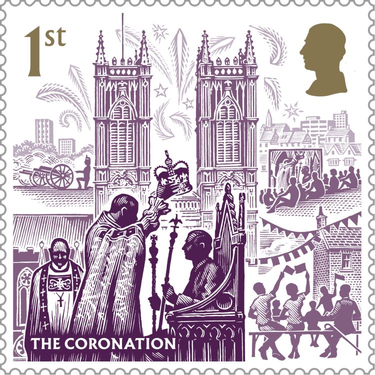
The purple stamp – typically considered a regal colour – pictures the Coronation, with the Archbishop of Canterbury lowering the crown onto King Charles III’s head as he sits in the Coronation chair, holding the Sceptre with Dove and the Sceptre with Cross. It is set in front of Westminster Abbey with fireworks above and a gun salute in the background as crowds look on.
The theme of diversity and community has been worked into the blue stamp, which features figures representing the Jewish, Islamic, Christian, Sikh, Hindu and Buddhist religions. The background reveals both rural and urban Britain and various places of worship that are found around the UK.

Illustrated in red is a imagined Commonwealth meeting, references to the Commonwealth games and some flags of Commonwealth nations, as well as a Commonwealth War Graves cemetery.
On the final green stamp, Davidson created an image to represent sustainability and biodiversity, including natural landscapes, sustainable farming methods and renewable sources of energy, such as hydroelectric power and solar panels. It also features images of forests, wildflower meadows and pollinating insects and people practicing traditional crafts such as hedge-laying and beekeeping.

Chilvers describes “treating the space like a stage set” as the most important “compositional decision”. Each illustration has been designed with “receding layers that get progressively lighter in tone”, revealing different points of interest as you look deeper into the scene, he says.
As with all stamps, one of the most challenging aspects of the design is the small scale. Chilvers says the design team worked hard with the printers to achieve this miniaturisation from an 8-inch wood engraving “without losing the detail”.

Atelier Works opted to use the typeface Albertus designed by Berthold Wolpe, says Chilvers, because “it has the character of a font cut by hand into stone” and naturally fits with Davidson’s hand cut wood engravings.
Each colour was chosen for its regal links and had to be dark enough to hold the fine line detail. The fact that the stamps are all “special colours” also helped preserve the detail, says Chilvers, explaining that “an awful lot of experimenting went on to get a tonal match”.

-
Post a comment


